6 Website Mistakes That Are Secretly Hurting Your Brand (And How to Fix Them)

If you’ve ever visited a website and immediately felt off about it, chances are it’s because of small (but crucial) design mistakes that make it harder to trust, navigate, or even look at. And if your website has even one of these issues… well, we need to talk.
No judgment (okay, maybe just a little), but if you’re guilty of any of these website design sins, it’s time for a quick refresh. Here are six common website mistakes that could be driving customers away—and how to fix them ASAP.
1. Overly Fancy Fonts That Look Like Wedding Invitations
You know the ones—swirly script fonts that are impossible to read or fonts that belong on a medieval scroll. If visitors have to decode your website like it’s a secret treasure map, they’ll just leave.
Fix it: Choose stylish yet readable fonts. Stick to a clean, modern sans-serif or a highly legible serif for body text. Use script fonts sparingly—like in logos or accents, not your entire headline.
2. Stock Photos That Scream “I Googled This”
If I see one more generic image of a woman laughing alone with salad or business bros aggressively shaking hands in grayscale, I might actually scream. These outdated stock images make your brand look generic and impersonal.
Fix it: Invest in brand photography or use high-quality, on-brand stock photos from paid sources like Styled Stock Society, Haute Stock, or Unsplash (just avoid the cheesy ones). Your visuals should reflect your brand’s unique personality.
3. Buttons That Say ‘Click Here’ (But… Why?)
“Click Here” doesn’t tell me anything. Is it a surprise? A digital scavenger hunt? If your call-to-action (CTA) buttons don’t clearly communicate what happens next, people won’t click.
Fix it: Be direct and compelling. Swap “Click Here” for action-driven CTAs like:
🚀 “Shop Now”
📥 “Download Your Free Guide”
🎉 “Steal This Deal”
🛍️ “Add to Cart”
4. Pop-Ups That Ambush You Like a Toddler at 6 AM
You just landed on a site, and BAM—a pop-up. Then a spin-the-wheel promo. Then a chatbot aggressively asking if you need help. Give people a chance to breathe before bombarding them with offers.
Fix it: Set pop-ups to trigger after a visitor has spent some time on your site (think 10-30 seconds or after they’ve scrolled a certain percentage). Also, limit the number of interruptions so your site doesn’t feel like an ad-fueled battleground.
5. “Coming Soon” Pages That Have Been There Since 2019
Are we sure this is actually coming soon? Or is it like when I say I’ll clean my desk but never do? A page that’s been “coming soon” for years makes your brand look stagnant.
Fix it: If the page isn’t launching soon, remove it. It’s fine. We’ll all move on. And when it is ready, you can announce it properly.
6. Missing Favicon (Aka, Your Website’s Tiny ID Badge)
That little icon in your browser tab? That’s a favicon—it’s basically your website’s profile pic. If you don’t upload a custom one, your site will show a default globe or (worse) your website platform’s logo. This tiny detail makes a big difference in looking polished and professional.
Fix it: Upload a favicon that matches your brand identity—your logo, an icon, or even your initials. It takes two minutes and makes your site feel complete.
So… Are You Guilty? 😏
No shame, but if you’re nodding along, it might be time for a little website glow-up. A few small tweaks can make a huge difference in how visitors perceive (and trust) your brand.
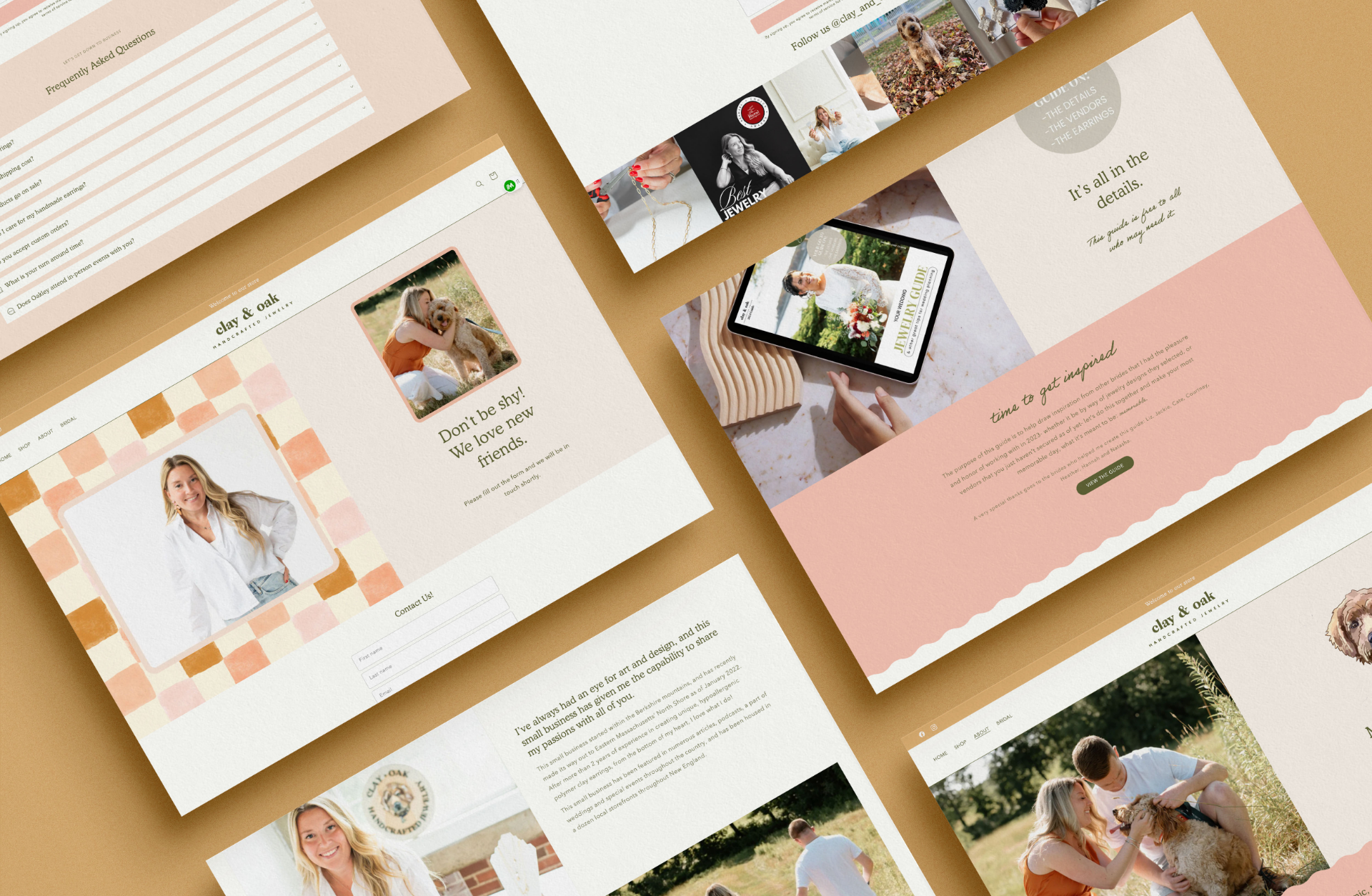
Need help? I can take a look at your site and tell you what’s secretly annoying your customers. Let’s fix it before they click away. Check out my Website in a Week service to get a polished, high-converting site—fast.
Random But Important: My Latest Obsession
Lately, I’ve been on a Korean skincare kick (thanks, Netflix K-dramas). One thing led to another, and after a very deep YouTube rabbit hole, I overhauled my entire skincare routine.
If you’re curious, I’ve been loving the Skin1004 line. Their products? Amazing. Their website? A little guilty of the issues above (including my biggest pet peeve… rhymes with ‘ravicon’). Skin1004, if you’re reading, let’s chat. 😘
TL;DR – Quick Fixes for a More Professional Website
✔️ Use readable, modern fonts (no wedding invitation vibes) ✔️ Invest in quality brand or stock photos ✔️ Write clear, action-driven button text ✔️ Don’t overwhelm visitors with pop-ups ✔️ Remove outdated “coming soon” pages ✔️ Upload a favicon for a polished look
Making these changes? Let me know—I’d love to see the before & after. 👀
Looking for more? Here’s what to read next: