The Branding & Shopify Web Design for a Luxury Dog Crate Brand
The WildHive Client:
Rock Creek Crates is a dog accessories brand that offers the best crash-tested, durable crates on the market.
Rock Creek Crates is a small, family-owned business whose main focus is continuing to “produce good, honest products for good, honest people”. They have a mission to bring strength, safety, and innovation to the world of dog crates. Owners Shawn and Chalyce understand the value dogs bring to their owner’s lives and strive to provide them with the very best.
“Everything we do is geared toward quality, creativity, safety, and adventure. We work to bring you products that are built to be amazing – just like the dogs who use them.”
Why I was buzzing to get started:
At WildHive, I value working with clients who have a strong passion for their business and for doing good. Chalyce and Shawn are truly good people who place a lot of importance on customer satisfaction. The care and consideration that they pour into offering the alpha of dog crates shows every time they speak about their business. If you read their customer reviews, you’ll see that I’m not alone in this experience. Their website is filled with raving reviews from dog owners and professionals who have received 5-star care from the owners themselves.
So, needless to say, I was honored when RCC entrusted WildHive with the rebrand and redesign of their website.
The Goal:
Rock Creek Crates came to me looking for a professional they could trust to take their brand aesthetic to the next level. Looking at their top 2 competitors, they knew they could be doing more to convey the high quality of their products to potential customers. Starting with brand design, the goal was to develop a new look that captured the attention of their niche in the durable dog crate market. Then, once the brand design was finished, we would translate the new aesthetic onto a Shopify website designed for conversion.
The Process:
Starting with Strategy
Before we could dive into the brand design itself, we first had to start with strategy. Chalyce and I scheduled a kick-off call where I asked her a series of questions to better understand her business, goals, target audience, and brand personality. After the call, I combined my call notes with in-depth research of her competitors. All of my findings were then compiled into a strategy presentation that outlined topics such as: Brand traits, values, voice & tone, key messages, unique selling propositions, target audience, competitor analysis, positioning, and creative direction.
Brand Design
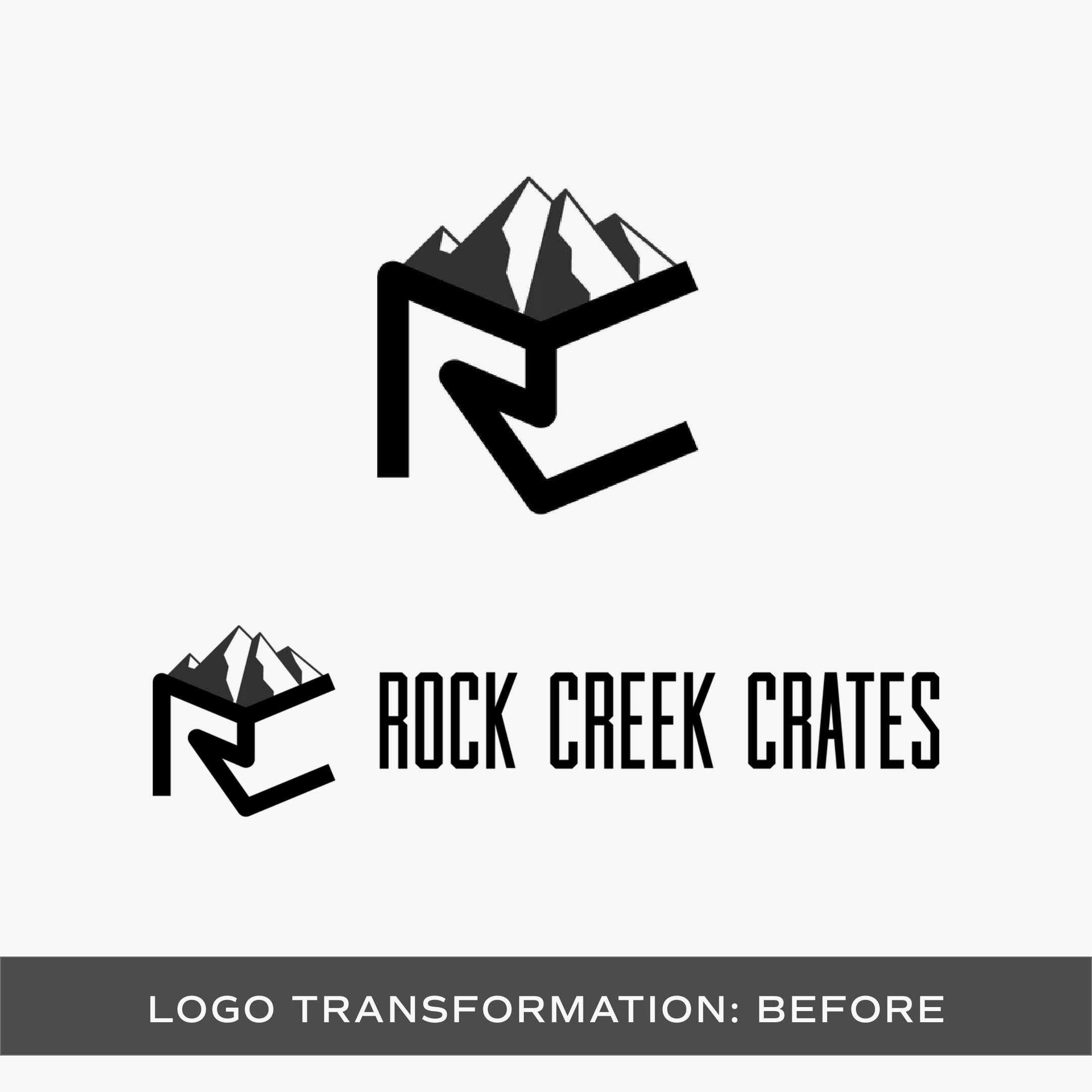
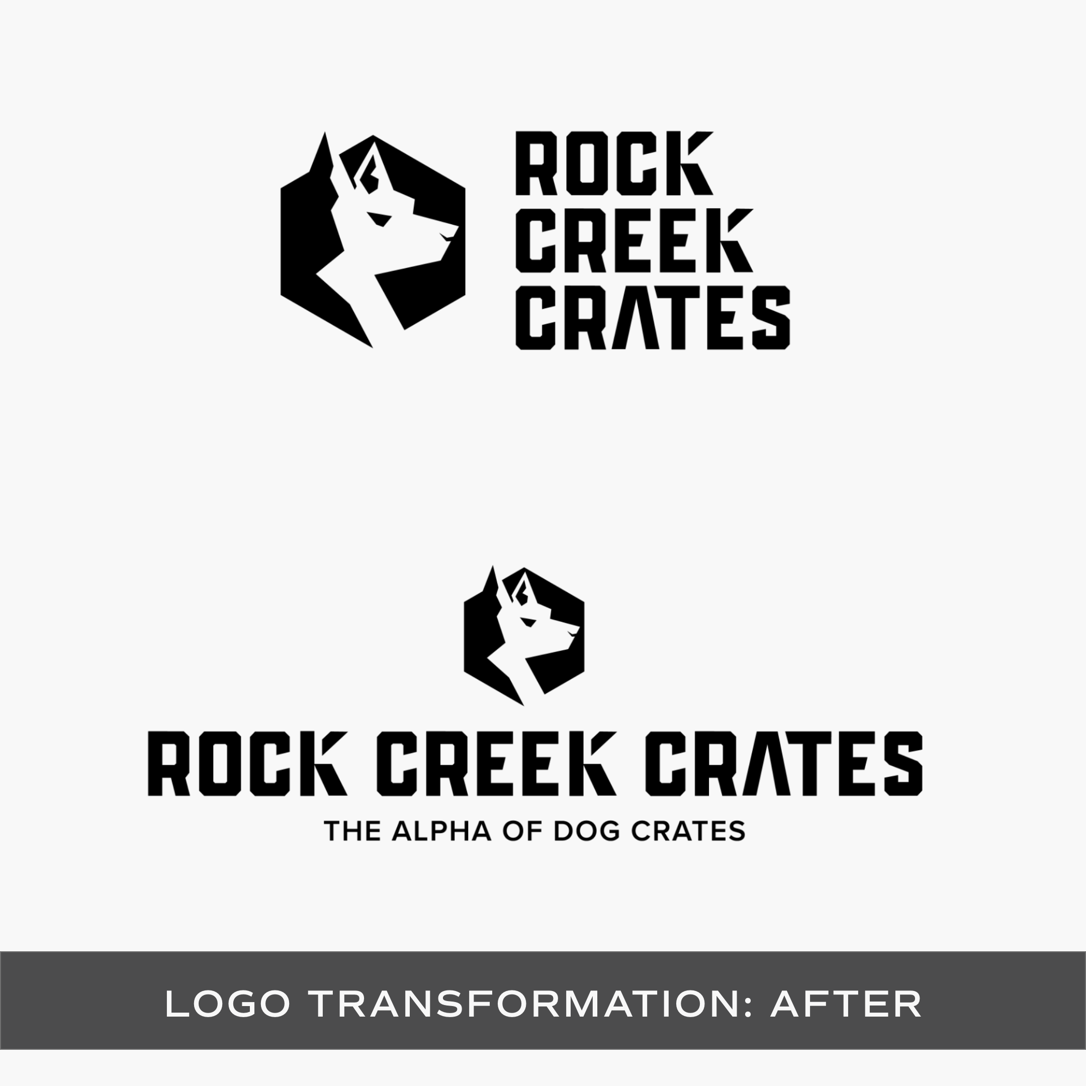
Once we were aligned on the creative direction, I began designing concepts for their new logo suite. By starting with strategy, I was able to keep her target audience in mind as I made each design decision. This ensures that my clients, like Rock Creek Crates, can walk away with an aesthetic that not only looks good but will catch the attention of their ideal customers.
Website Strategy & Design
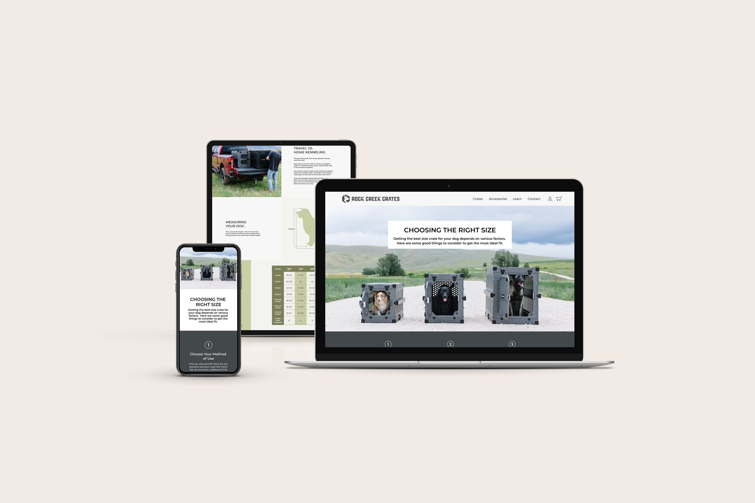
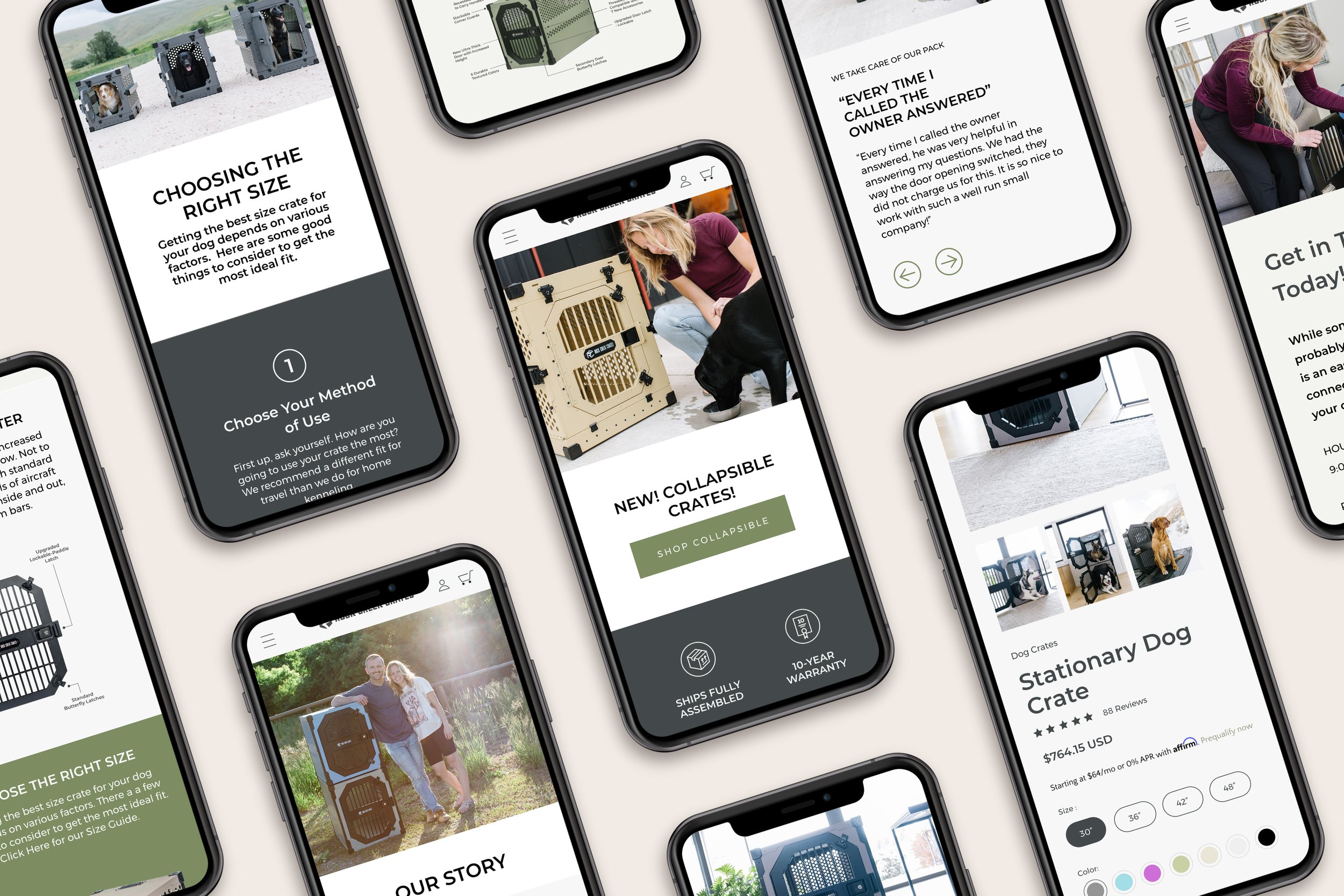
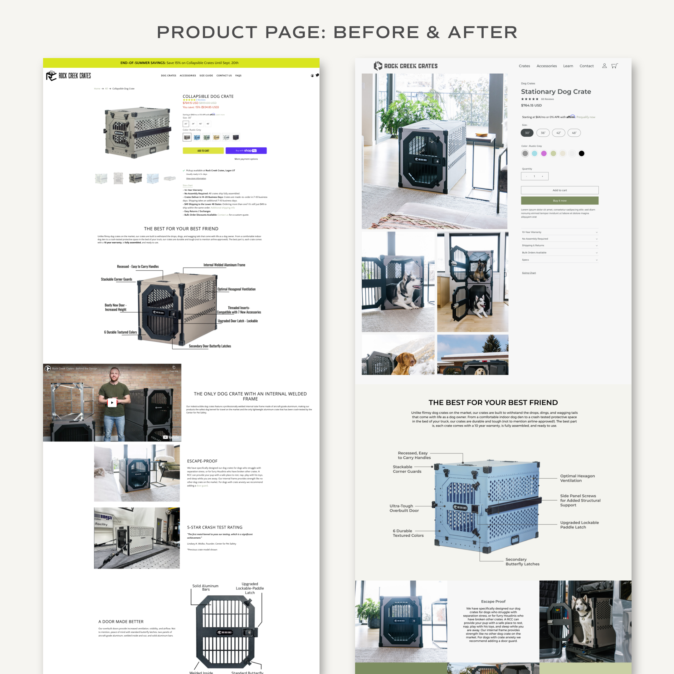
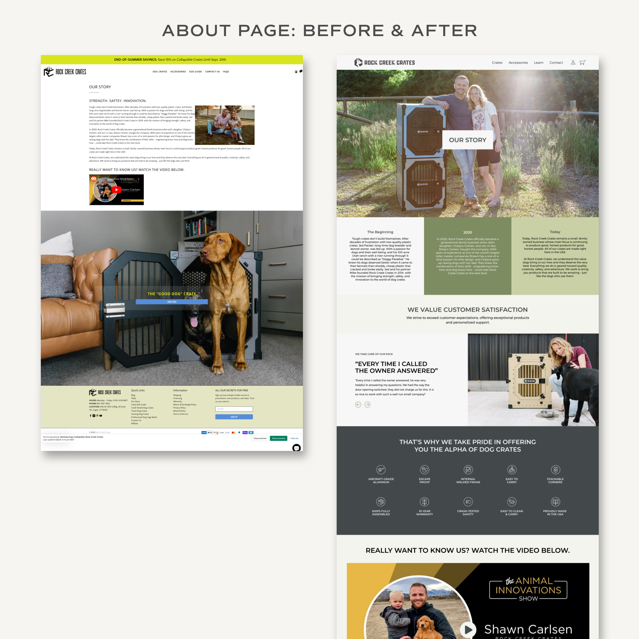
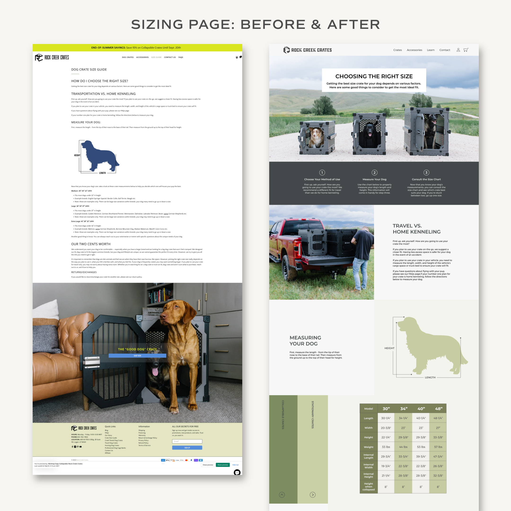
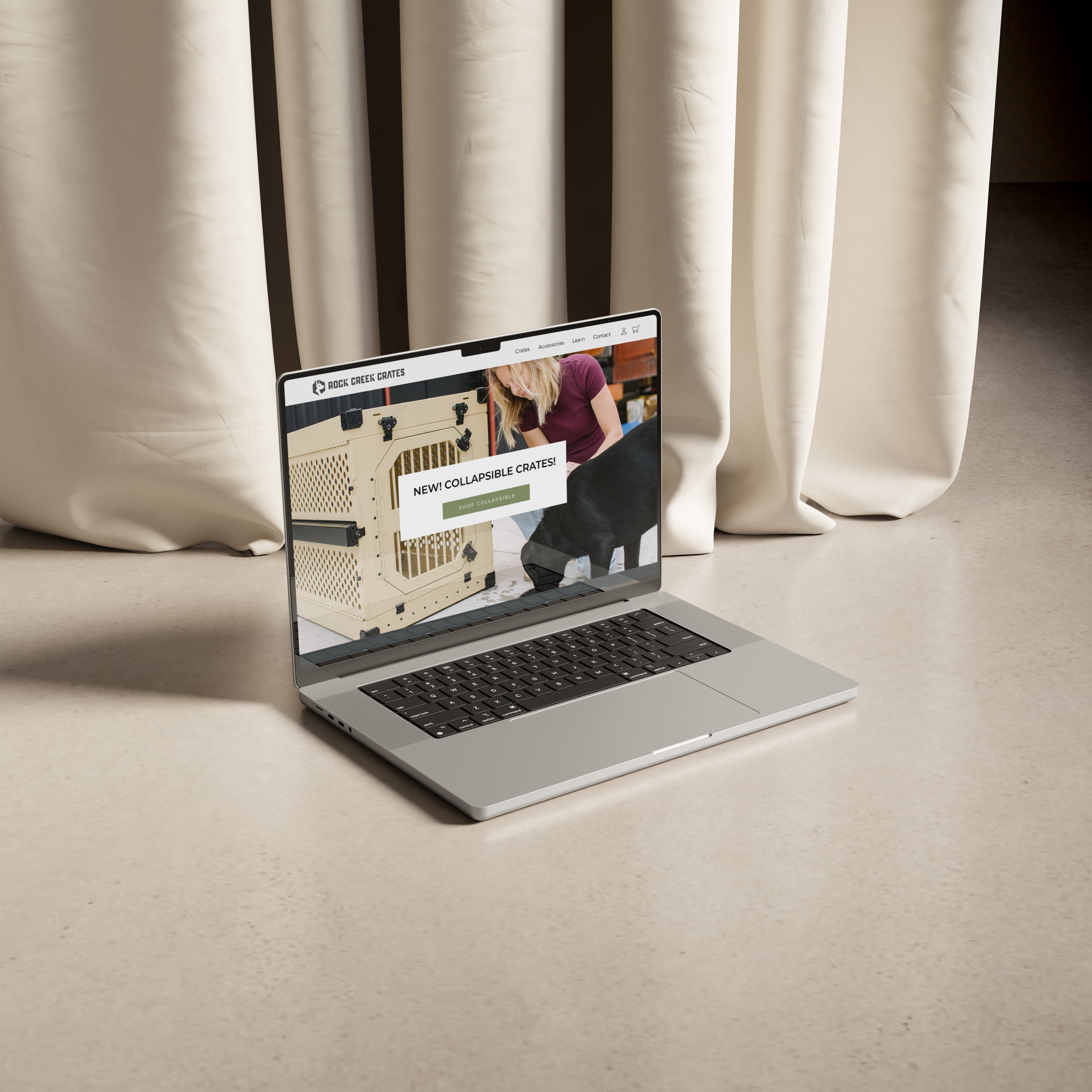
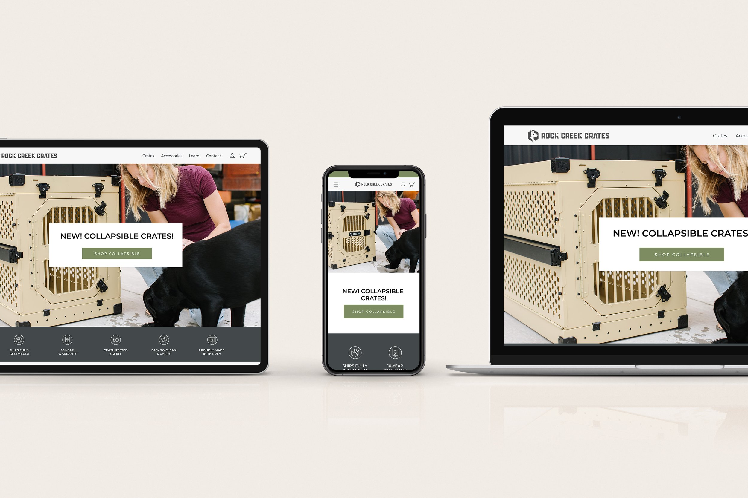
Once the brand design was finished, we began the website strategy and design. Again, we referred back to the brand strategy deck to make informed decisions on the website design. I created a mockup of the website that the Rock Creek Crates team could review and add their feedback to. Once the design was fine-tuned, I brought it to life on Shopify and prepared it for launch while their current website remained active.
When the new website was approved, we chose a launch date. On the launch date, I published their new website and made sure everything was working correctly!
Once the website was launched, we began our 30-days of post-hand-off support. This means that the Rock Creek Crates team can email me with any questions or concerns so I can continue to assist them as they get acclimated to their new website.
I also provided RCC with a library of custom how-to videos guiding them through how to maintain their website as they grow. This library is a valuable tool that allows my clients to better understand their website and prevent maintenance costs down the line.
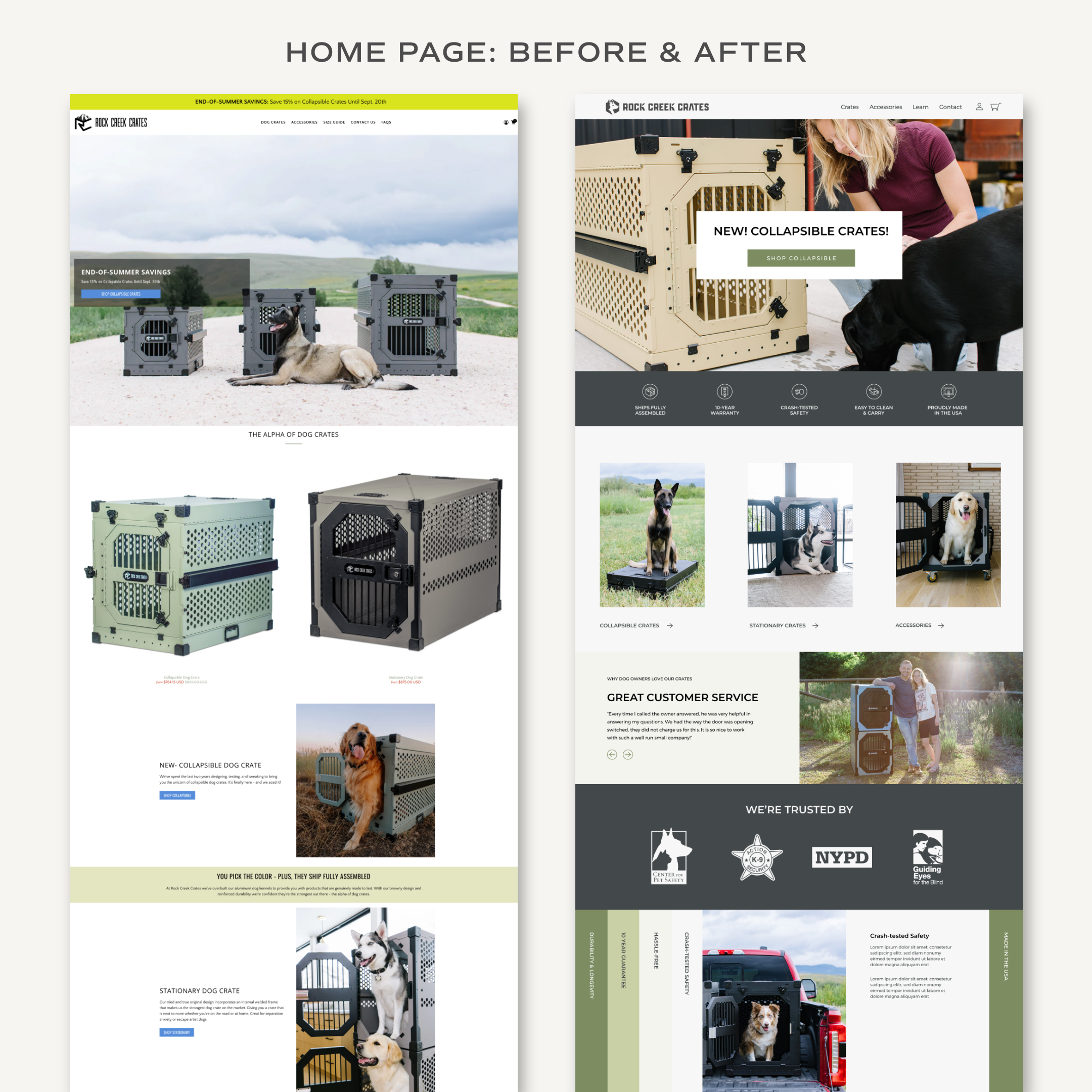
Take a look at the transformation!
The Final Result:
Before working with WildHive, the Rock Creek Crates team expressed that they had a lack of unity and clear branding. They wanted a more powerful, impactful website like that of their competitors while still standing apart and resonating with their unique niche in the world of durable dog crates.
They chose WildHive Studio because of my “simple approach to design and clean, modern style". They were blown away throughout the process by my “organization, quick response time, and amazing attention to detail.”
Here’s what they had to say at the end of the project:


