Why Your Shopify Store Needs User-Friendly Navigation - 3 Secrets Revealed!
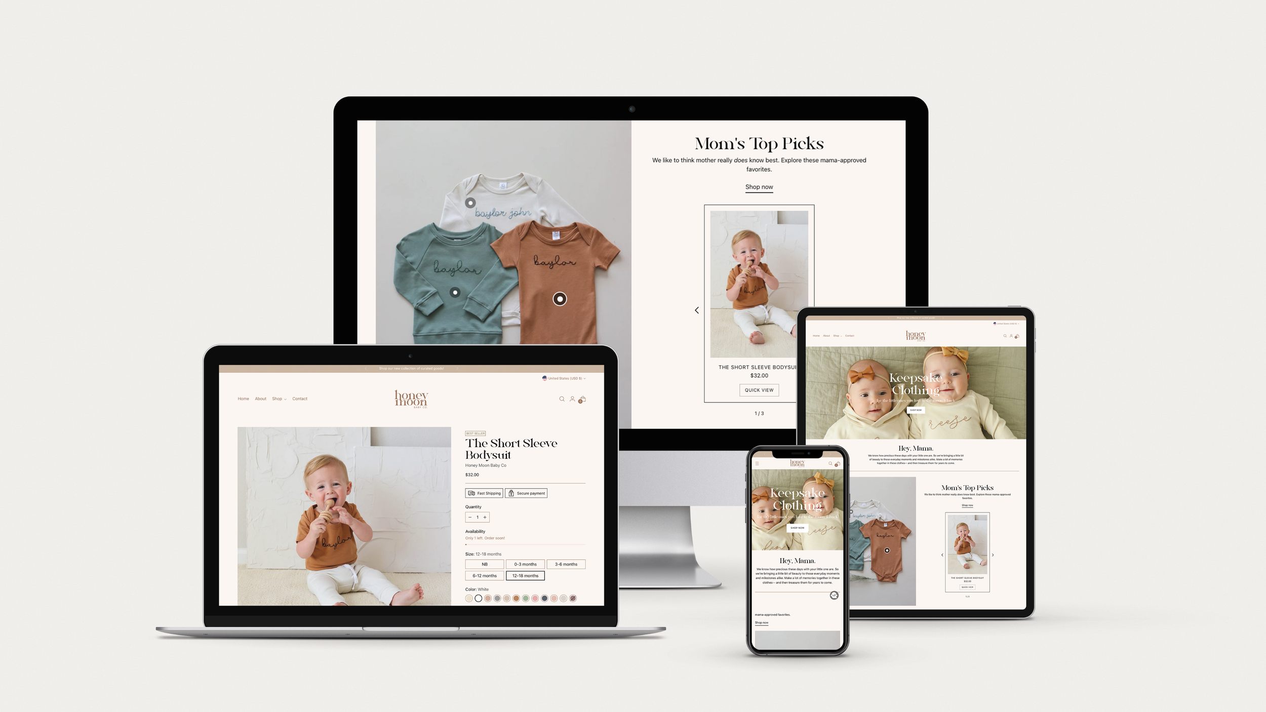
As an online retailer, you know your Shopify store's success depends on the user experience you provide. One crucial factor in creating a seamless shopping experience is your store's navigation. Did you know that 50% of web users will abandon a site if they can't find what they're looking for? That's why creating a user-friendly navigation system is crucial. In this article, I'll reveal three secrets to optimizing your Shopify store's navigation to improve customer engagement and drive sales. By the end of this post, you'll know how to keep your store organized, design efficient navigation menus, and make it mobile-friendly. Let's get started!

Understand Your Customer's Journey & Utilizing Effective Navigation Design
To create a user-friendly navigation system, start by understanding your customer's journey. This begins with keeping it simple and organized. Avoid cluttering your homepage with too much information or too many categories. Customers should be able to find what they're looking for with ease. Categorize your products in a way that makes sense to your audience. Use clear and concise labels that are easy to understand. For example, if you sell clothing, use categories such as "Women's", "Men's", "Kids", "Accessories" instead of vague labels like "Collections" or "Shop". By keeping it simple and organized, you'll not only improve the customer experience but also increase the likelihood of customers finding and purchasing what they're looking for.
Effective navigation design means using intuitive icons, highlighting important categories, and enabling customers to easily navigate back and forth between pages. By doing this, you'll encourage customers to explore your store and increase their engagement with your products.
Keep It Simple and Organized
The principle I mentioned above also applies to the overall layout of your homepage. If your customer is scrolling down the homepage, the information they see should be organized to best suit their journey. This means showcasing your products, building trust with customer reviews, and properly educating your customer on what sets your products apart from others in your industry. By paying attention to the smaller details, you'll enhance the customer experience, making it easier and more enjoyable for customers to find what they are looking for. Once you have achieved this, you can take your navigation system one step further by utilizing effective design to improve your store's customer engagement and sales.
Incorporate Search Functionality
Improving your store's navigation through effective design is essential to keep customers engaged and increase sales. However, there is another way to enhance navigation that can make a significant difference: incorporating search functionality. With search functionality, customers can easily find the products they want without having to browse through numerous categories. This can save time and effort and make the shopping experience more enjoyable.
By implementing a robust search engine, you can help customers find what they're looking for quickly and efficiently. It's essential to ensure your search engine is intuitive and user-friendly and that it provides accurate results. Utilizing features like autocomplete and filtering options can further enhance your search functionality.
With search functionality, you can take your store's navigation to the next level and provide an even better shopping experience for your customers. In the next section, we'll explore how making your store mobile-friendly can boost sales even further.
Make It Mobile-Friendly
With over half of all internet browsing taking place on mobile devices, it's crucial to ensure your Shopify store's navigation is mobile-friendly. You don't want potential customers struggling to navigate your site or giving up on purchasing altogether because of poor mobile functionality.
To make your store mobile-friendly, you’ll want a responsive design for your website. This means the layout of your site will adjust to fit the user's screen size, whether they're on a desktop, tablet, or smartphone. Additionally, make sure your font size is large enough for easy reading on smaller screens, and that your buttons are big enough to click without accidentally tapping something else.
Another important aspect of mobile-friendly navigation is ensuring that your menus are clear and concise. Use dropdown menus sparingly, as they can be tricky to navigate on mobile devices. Instead, consider using a hamburger menu (three horizontal lines) to display your navigation options.
Finally, be sure to test your site on various mobile devices to make sure it's functioning properly and is easy to use. By making your Shopify store mobile-friendly, you'll be giving your customers the best possible shopping experience and increasing the likelihood of making a sale.
In conclusion, creating user-friendly navigation for your Shopify store is essential for keeping customers engaged and driving sales.
By understanding your customer's journey, keeping it simple and organized, utilizing effective navigation design, incorporating search functionality, and making it mobile-friendly, you can optimize your store's navigation and see increased customer engagement and loyalty. Remember, creating an easy and enjoyable shopping experience for your customers will lead to a successful and thriving business. So, start implementing these tips today and watch your Shopify store flourish. As Steve Jobs once said, "Design is not just what it looks like and feels like. Design is how it works."
Looking for Shopify designer & developer you can trust? At WildHive I create user-friendly Shopify websites for your customers and for YOU!
You’ll walk away with all the tools you need to easily update and maintain your website as you grow.