Packaging & Branding for an Organic Skincare Brand
The WildHive Client
Aerthen is a conceptual cruelty-free and organic skincare company that focuses on full-body hydration and health. They aim to help other customers properly take care of their skin by using high-quality, natural ingredients.
Here's a look at their old logo.
Why I was Buzzing to Get Started:
As a conscious consumer who cares about the Earth and the animals in it, I wanted to conceptualize an organic skincare brand that would be aligned with my own values. I desired to design a line of products that I would be interested in buying and recommending.
The Challenge
The conceptual founder of Aerthen, Georgie, came to WildHive looking for a refresh and reset in multiple ways. Since the recent increase in production costs to ensure that their organic ingredients were sustainably and ethically sourced, she had seen a dip in sales. In order to maintain her business’s profitability, she had increased her products’ retail prices and discovered that her customers weren’t willing to pay the difference. Looking to solve this problem through strategic branding and packaging design, she turned to WildHive.
Our Solutions:
Since Aerthen was facing a multi-faceted problem, I broke the solutions down into three phases. First, I started by taking a look at their current brand and marketing channels and surveying their past customers. Then, I created a new, strategic brand identity that better connected with conscious consumers. Lastly, I used their new branding to create a beautiful packaging experience that felt luxurious and reflected the new price point.
Deliverables:
Brand Strategy & Design
Product Label & Packaging Design
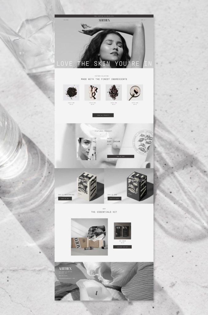
Website Design & Development (Launching Soon)
Social Media Strategy & Instagram Graphic Templates (Launching Soon)

Two flat lay packaging designs in cream and black
Learning from the Past to Shape a Strategy for the Future:
I kicked off our project together by diving into their brand’s mission, vision, values, and voice by working through a series of guided questions together. I also took time to survey Aerthen’s past customers and online audience to uncover why they no longer felt as inclined to purchase, how they felt about the product, and how much they knew about the brand itself.
I quickly discovered that many of her customers were unaware of her brand’s values and mission. Without understanding the quality of her ingredients and ethical nature of her sourcing, they felt that they could get a similar product somewhere else for a lower price. Her past customers and audience lacked brand loyalty.
Using these valuable insights, I built a strategy around educating her current audience and attracting new potential customers by clearly communicating her brand’s story. I wanted to create an emotional connection with her customers and provide them with a branded experience that reflected the high-quality nature of the product.

Mailer box packaging design with custom packaging tape and tissue paper designs
02. Developing a Clean, Luxurious Skincare Brand
Aerthen was named by combining the words “Earthen” and “Air”. This was to reflect the lightweight feeling of the organic skincare line and all-natural ingredients. I sought to continue reflecting these 2 defining qualities through our design choices. Here’s what I did:
I chose simple, yet strong fonts to evoke the minimalist approach to her formulas and the trustworthy nature of her ingredients.
I kept the color palette of her products limited to black and white to give them a luxurious and high-quality feeling.
I added gentle curves and small details to her logo suite to make the brand feel more approachable and organic amidst its bold, contrasting palette.
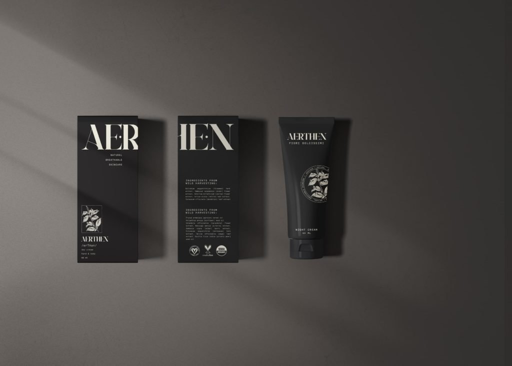
black product box packaging design and product label design
03. Telling their story through memorable, emotional packaging
Once the products themselves were designed, I set out to create product boxes that told Aerthen’s story. With the front and back of the product boxes containing the logo, ingredients, and other required details, I used the side panels to share the brand’s values and origin story.
I created a design that guides the customer’s eye, prompting them to keep turning the box until they’ve seen each carefully placed detail.
WildHive's Favorite
Our favorite of this project was seeing the website come to life on Shopify. I redesigned the homepage to continue to tell Aerthen’s story and inspire each customer to share the brand and connect with the growing online Aerthen community.
The Final Results:
Aerthen walked away with the tools they needed to overcome their dip in sales. They were able to realign the look of their brand to reflect their values and effectively communicate what they stand for to their audience. With their brand, product labels, packaging, and website all sharing a cohesive look, they’re prepared to wow their customers with a high-end, memorable, and emotionally connecting experience.
Ready to transform your business with brand and packaging design? Let’s get started!

Desktop website design for Shopify ecommerce store

cream product box packaging design and product label design

Black product box and sticker packaging design

Cream product box and sticker packaging design

Organic skincare product label design

Embossed thank you card envelope for organic skincare brand
Desktop website design for Shopify ecommerce store