Packaging & Brand Design for a Landscape Design Business

The WildHive Client: Pot & Spade
Pot & Spade is an online landscape design business that works to transform outdoor spaces into places people can enjoy. They strive to curate spaces that make spending time outdoors easy, enjoyable, and a beautiful experience. See how we explored a rejected concept from this project and turned it into a captivating brand and packaging experience.

Instagram feed and profile design
Why we love working with a horticulture brand
Right away, we loved the unique business idea that the founders of Pot & Spade were pursuing. We saw the need for their services online and how their passion and immense knowledge of horticulture would help their clients by providing them with the right landscaping choices for their location’s unique terrain and climate.
The Challenge: Understanding their client's behavior
The founders of Pot & Spade came to WildHive looking for clarity and alignment. They wanted guidance in uncovering who their primary target is, their buying behaviors, and how to best reach them with their service. They also wanted to make sure that their business was set apart from local landscaping businesses that focused on the labor and not the design. By having unique branding and packaging design, they sought to set themselves apart while giving their customers a high-end experience.
The process that brought their innovative landscape design business to life
The solutions for Pot & Spade are threefold. First, we started with their brand strategy. Then, we created branding that set them apart and clearly communicated their services. Lastly, we used their new branding to create a beautiful unboxing experience and presentation for their customers.
1. Brand Strategy
We kicked off our project together by diving into their brand’s mission, vision, values, and voice by working through a series of guided questions together. Once we had a better understanding of their brand and services, we were able to pinpoint the group of people who would value their services most.
2. Brand Design
Differentiating their brand through color and typography
In order to set their brand apart from the landscaping labor industry, we specifically avoided shades of green and over-used symbols such as shovels, trees, and rolling hills. Pot & Spade provides a high-end, custom experience and end product to their customers so we sought to express that through sophisticated fonts, clean linework, and a symmetric, detailed brand mark.
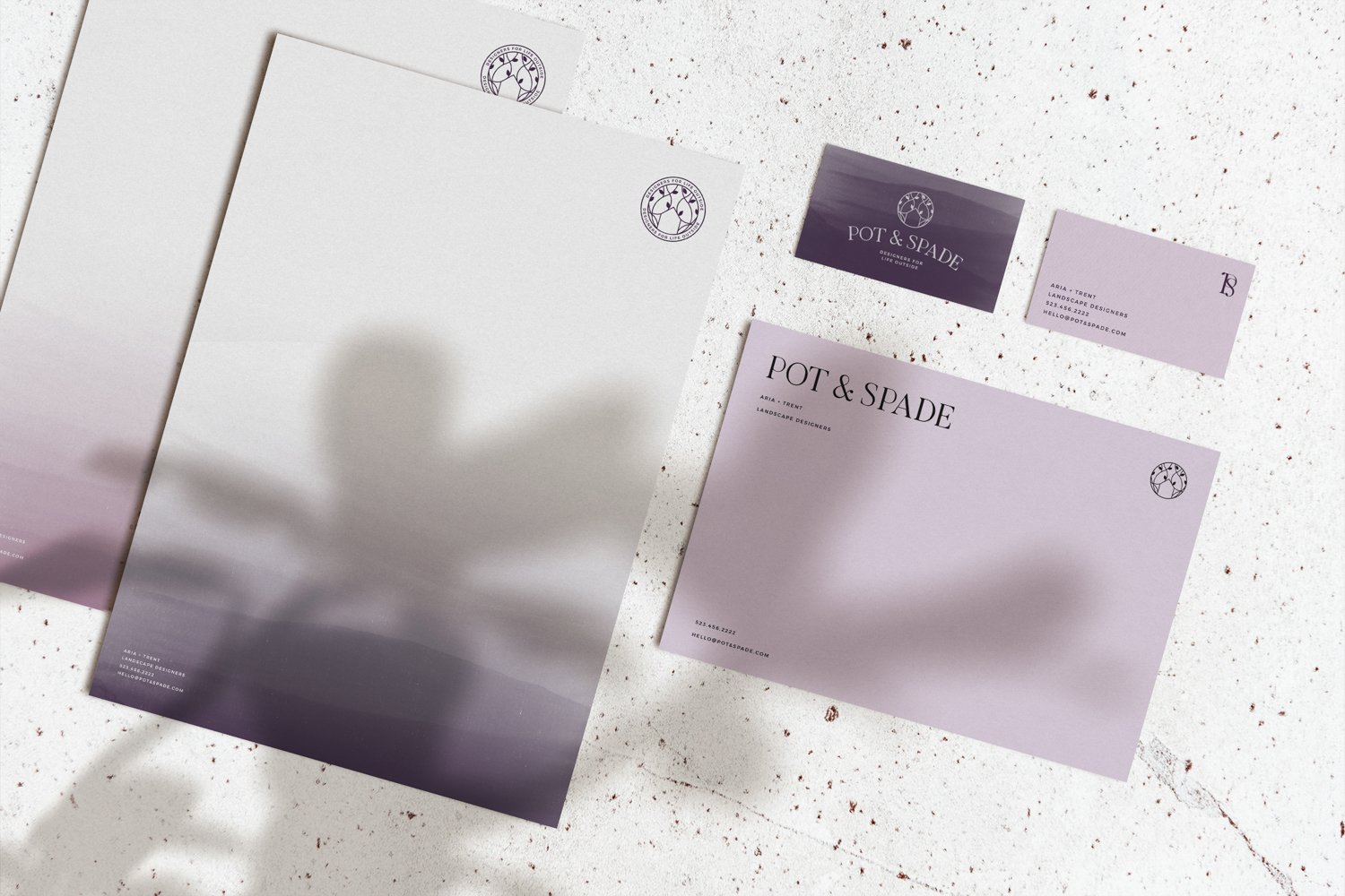
Purple stationery and letterhead design
We incorporated soft, painted textures into the brand identity to represent landscapes in a more abstract, modern way and used a rich shade of violet as their main brand color to represent the artistic, detailed nature of the landscapes they design.
3. Packaging Design
Creating a Memorable Unboxing Experience through Packaging
Using the new brand marks, color palette, and textures, we dove into the packaging design process focusing on providing their customers with a memorable reveal when receiving their landscape design in the mail. We wanted their unboxing experience and the landscape design itself to feel like a piece of artwork they could frame and display.

Mailer box design and thank you cards with purple painted texture

Purple recyclable mailer box and tissue paper packaging design with rubber stamp

purple canvas drawstring bag and rubber stamp packaging design

Packaging tape design in pink and purple
WildHive's Sweetest Packaging Design Victories
Our favorite part was creating the beautiful packaging design for this brand. At WildHive, packaging design is our specialty so naturally, we were buzzing to dive into creating a beautiful way to present their customers with their landscape design and plans. We designed all of their packaging materials with the environment in mind using sustainable boxes, inks, and papers.

Round, rectangle and square sticker design with brand colors and logos
The Final Result
Pot & Spade was able to walk away feeling confident in their branding’s ability to set them apart from landscaping businesses and position them as a high-end service. They were equipped with the tools they needed to effectively understand and reach their target audience while ensuring a positive customer experience through detailed packaging and presentation.
Ready to stand out, connect deeply, and sell more with brand and packaging design?

Mailer box and tissue paper design with purple branding
Project Gallery:

Recyclable mailer box design surrounded by landscape natural bark and moss
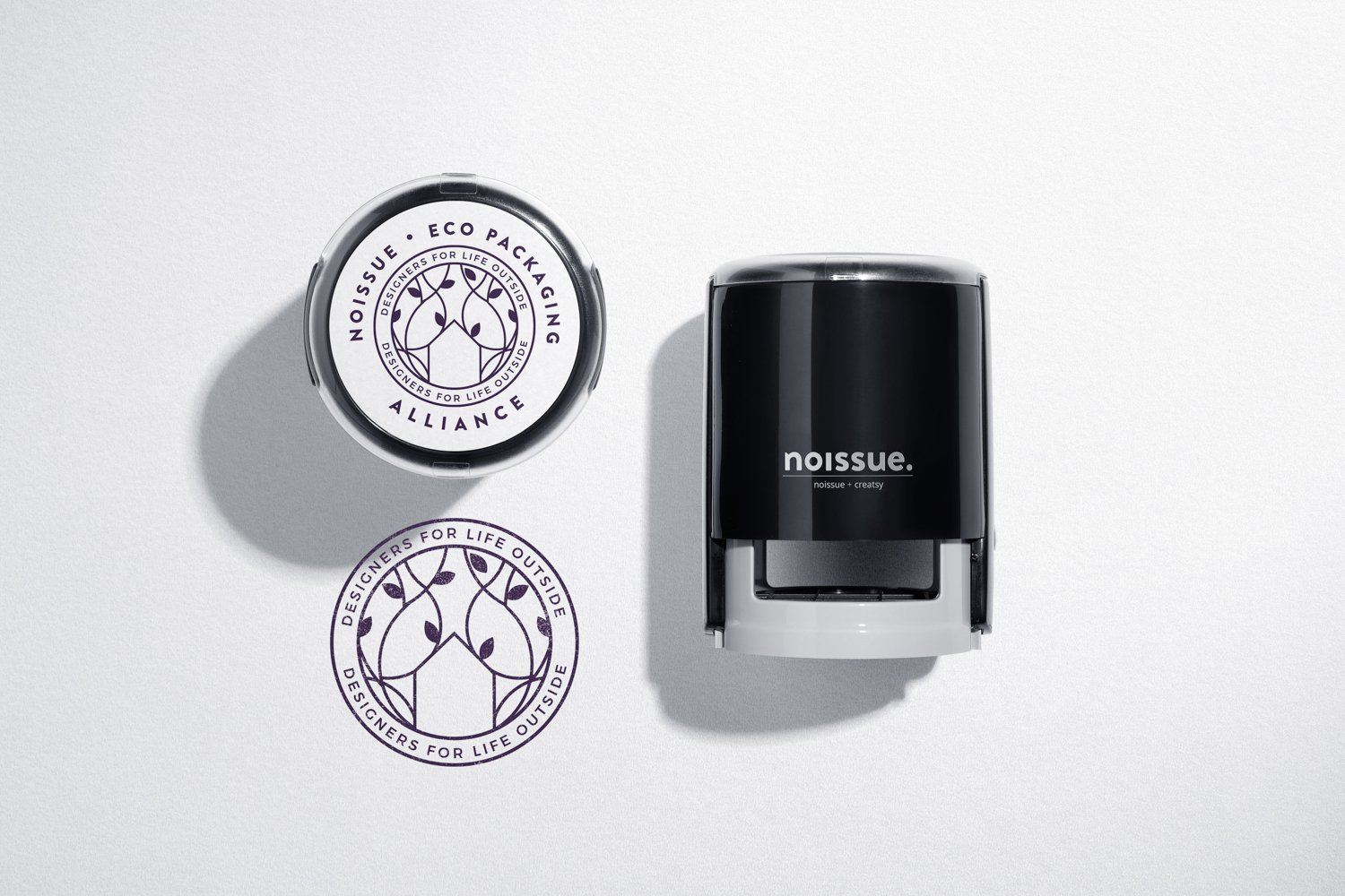
Self-inking rubber stamp with logo

Thank you card design with purple painted texture and logo

Mailer box design with custom designed packaging tape being placed on top