Packaging & Brand Design for an eCommerce Rug Boutique
The WildHive Client: OZEL, an eCommerce Rug Boutique
OZEL is a conceptual vintage rug boutique known for its eclectic collection of bold and bright rugs. Here's a look behind the scenes at the strategic packaging and brand design created for their business.
The client example for this passion project is sitting in a leather chair with a bold black dress and a bright red vintage rug
The Challenge: Going from in-store retail to online
OZEL’s founder is a seasoned business owner who’s owned a local brick-and-mortar boutique for a few years. However, when OZEL turned to e-commerce as many businesses have to bring in consistent sales, they found it hard to stand out amongst the increased competition. Social media was full of other vintage rug boutiques and while OZEL knew how they were different, they didn’t feel like their visual identity reflected what set them apart.
Our Process and Design Solutions
Our solution for OZEL was threefold. First, we took a look at their competition, brand values, mission, vision, and voice. Then, we used that information to strategically design a new, impactful brand identity that would help them stand out. Last, we extended that brand onto their website and packaging to create one, cohesive, and memorable experience.
Bold and gold letterhead and business card design
1. Brand Strategy - Getting to know the brand and its customers.
We kicked off this project by diving into the competitor analysis for OZEL. We looked at countless Instagram accounts offering vintage rugs to analyze their brand identity, personality, social media strategy, and offerings.
Since Ozel had been in business locally for a few years, we were able to analyze their current customer base as well to build a profile for their perfect audience. By understanding their customers, we would be able to better build a brand that attracts the right group of people.
To top it all off, we took a look at OZEL’s brand perception, their vision for the future, and the “why” behind their business. This helped us shape and outline clear brand values that we could weave into the brand’s visuals as we told their story through strategic design.
Packaging Design for an eCommerce Rug Boutique
2. Brand Design - Developing a brand that accentuates the product's unique selling points (USP's).
OZEL is a Turkish word that means “special” which is exactly what we set out to capture with this new brand identity. Here’s what we did to align the brand visuals with the brand personality:
We chose a unique and bold font to evoke the strong personality of the brand and its color palette.
Speaking of the color palette, we chose to go with bright red as the main color with accents of black, gold, and a rich green - all colors found in many of the Turkish rugs they sell. These colors also served to capture the vintage feel without blending in with the muted, neutral color palettes of their competitors.
We created a collection of hand-drawn icons for their brand pattern and website that mirror motifs found in Turkish rugs. The hand-drawn linework tells the story of the brand which is deeply rooted in Turkish heritage and history.
Packaging Design for an eCommerce Rug Boutique
3. Packaging & Web Design - Creating a memorable experience through packaging and website design.
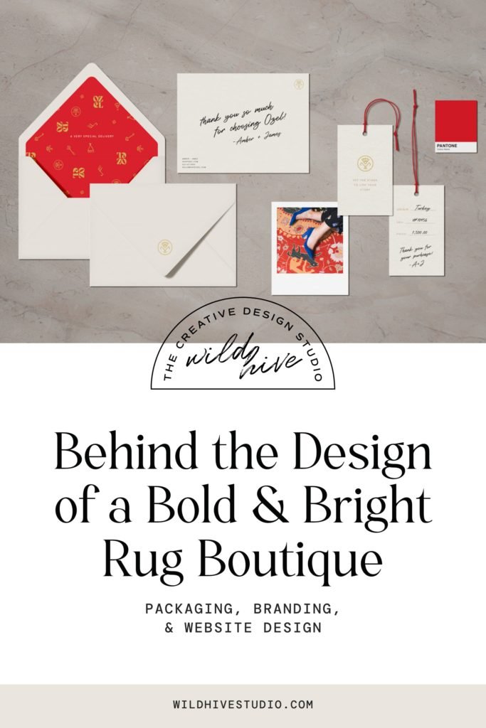
Once the brand was complete, we started translating it onto their print and packaging collateral such as stationery, product hangtags, packaging tape, and tissue paper. We sought to make each piece feel special and bring the customer into the story of the rug they purchased. We accomplished this by adding space for hand-written notes and details to be written on each product such as the rug's place of origin and history.
We also utilized the custom icons we created for the OZEL brand to educate the customers on what the motifs in their chosen rug represented. This served as a bridge between the rug and its buyer, merging their stories together and forging a deeper bond to their new statement piece.
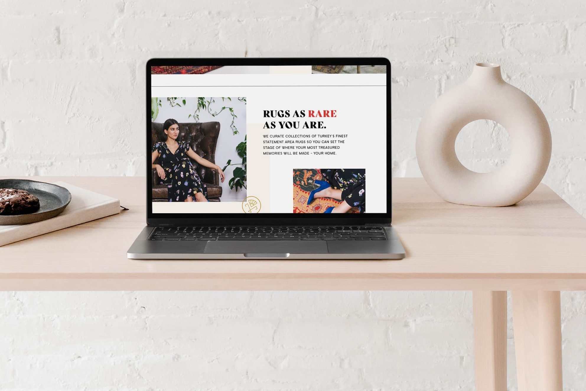
Website Design for an eCommerce Rug Boutique
The Final Result:
OZEL walked away with a completely transformed brand and the tools they need to set themselves apart online. They gained a deeper understanding of who they are as a brand as well as who their ideal audience is so they can better relate to them and build their online community of loyal customers.
Ready to stand out, connect deeply, and sell more with strategic brand & packaging design?
Bold and bright brand design and print collateral such as an envelope, hangtags, and thank you card
More Project Highlights:
A red mailer box with cream packaging tape being taped across the top
Bold and bright branding and packaging design for an eCommerce rug boutique


