3 Simple Packaging Design Tips for Beginners
If you're new to the eCommerce world, I'm sure you've started to realize just how many things go into getting an eCommerce brand off the ground. As a service provider, I don't envy the many moving parts you have to coordinate between design, marketing, analysis, selling, and shipping your products. Needless to say, it can be a lot. So, in this post, I'm going to break down 3 simple packaging design tips for beginners to help you get the most out of your launch.
Whether you're on a tight budget or just on a tight launch timeline, these tips are for you! And, in order to better showcase how to put these tips into effect, I'll be using Natural Cycles' packaging.
In case you're unfamiliar, Natural Cycles is a hormone-free birth control brand that uses basal body temperature to track a woman's cycle. It's the perfect solution for women who are turning away from hormones and prescription birth control, but want to stay in control of their family planning. It's an effective tool used for both pregnancy prevention and fertility tracking with the goal of conception.
Packaging Tip 1: Stick to one key brand color
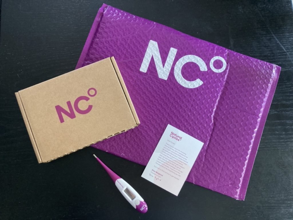
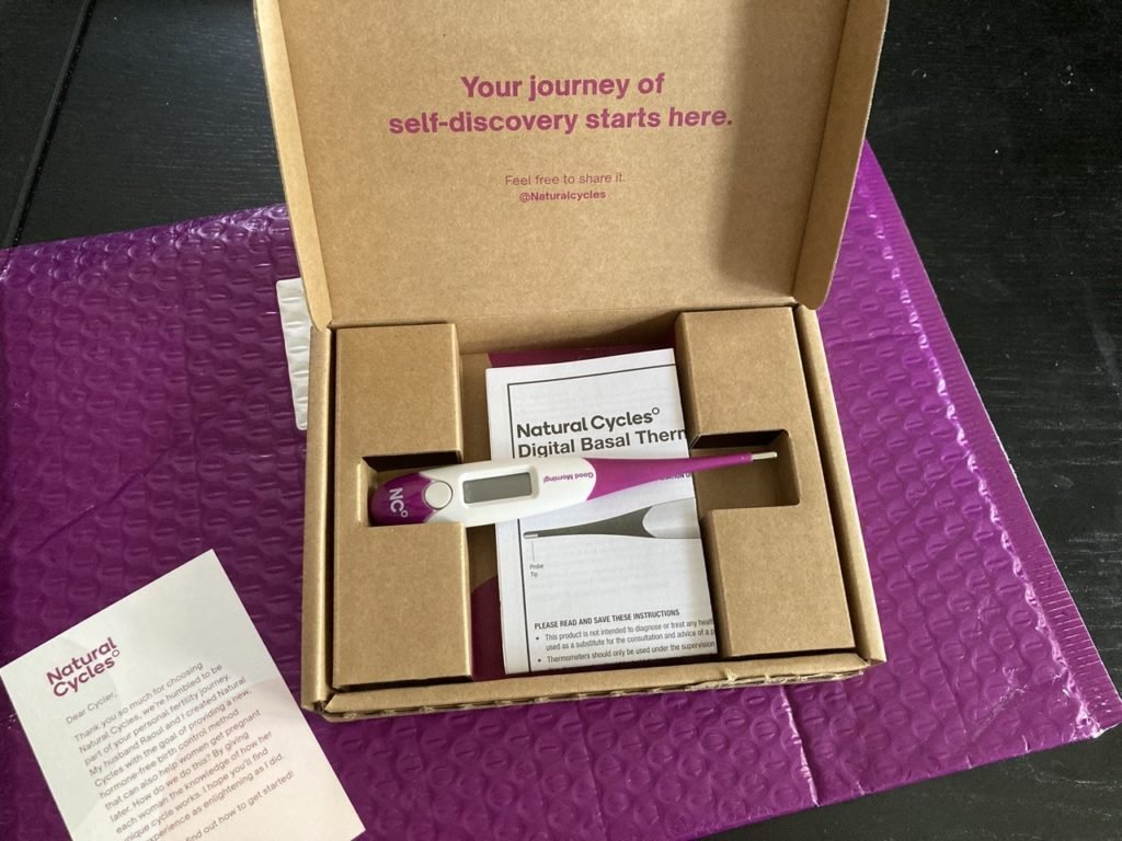
First of all, I love Natural Cycles. I use their thermometer and app daily to practice hormone-free, natural family planning. When I received my order, I was impressed by their unboxing experience so much that I kept it for this very post!
Their brand is simple but impactful and they truly made the most out of their eCommerce unboxing experience. They're the perfect example of how to grab the attention of your audience and start building brand recognition from the get-go.
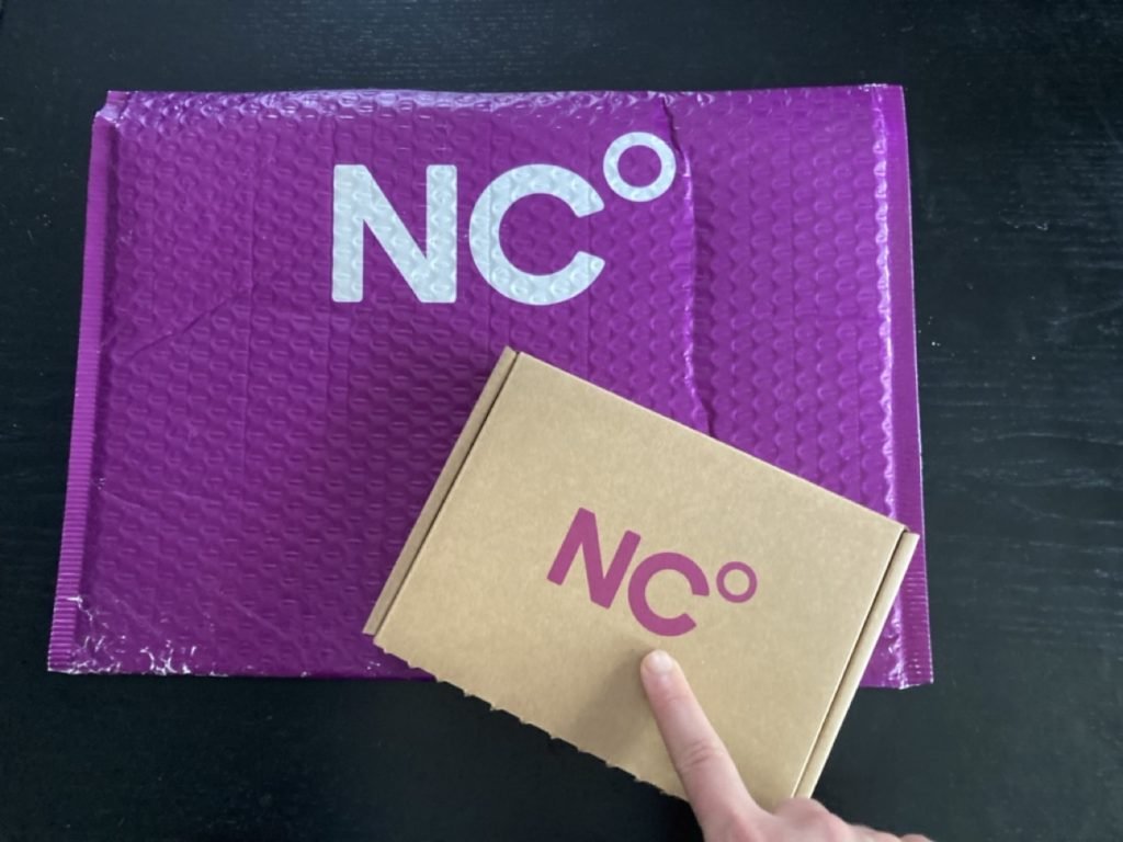
Take a look below at how Natural Cycles uses just one signature brand color to tie their entire packaging experience together. Their mailer is bold and bright. Then, as you open it, you find a simple eco-friendly cardboard mailer printed with Natural Cycles' signature brand color. It makes for a very balanced pairing that solidifies their brand color in the minds of their consumers. A.k.a. everytime I see that shade of purple, I'll be reminded of their brand. Or, when I'm looking for their products online, I'll know I'm in the right place when I see their purple.
See what I mean? It works.
Packaging Tip 2: Harness the power of the insert card!
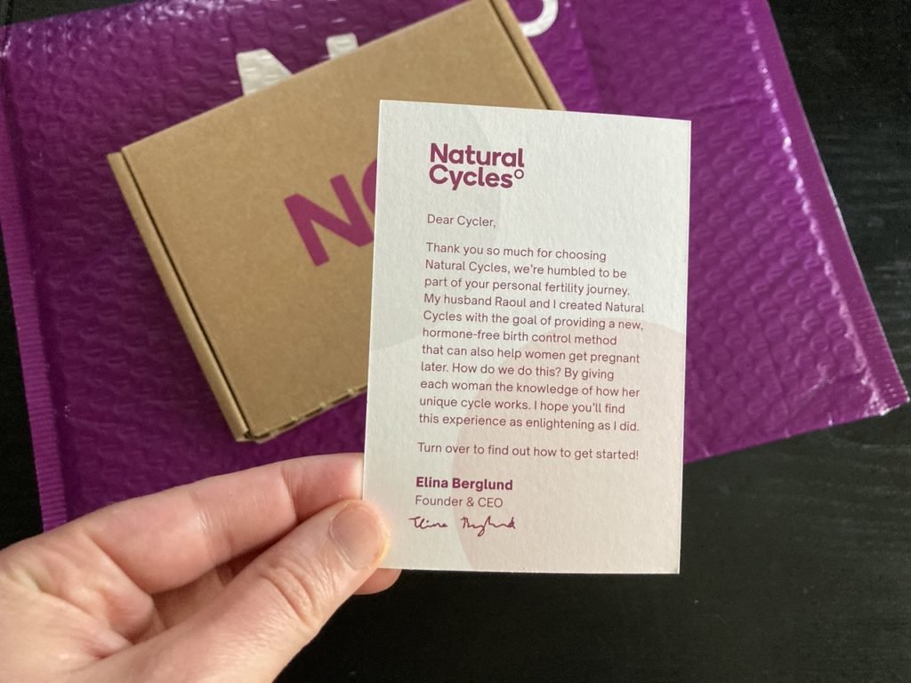
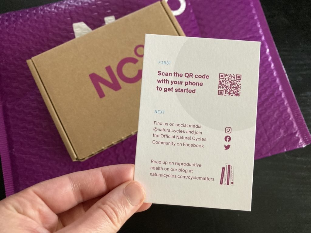
An insert card is an affordable and easy addition to your packaging experience that goes a long way. Take a look at the insert card for Natural Cycles.
It's small and simple in design
The front of the card is a note from the founder - this builds an emotional connection with the consumer.
The back of the card gives a clear call-to-action (CTA) letting the customer know what to do next. In this example, they can scan the QR code to get started with their app then head over to the Natural Cycles social media to get plugged into the community.
This card only has about 8-10 sentences on it and it covers all the basics of your customer's journey.
They bought the product, made an emotional connection with the brand, completed the onboarding process, and joined the brand's online community in just a few minutes. Genius, right? Or, rather, just simple yet effective.
Natural Cycles packaging insert card - front
Natural Cycles packaging insert card - back
Packaging Tip 3: If nothing else, keep the product protected!
When you're choosing which packaging design elements to include in your unboxing experience, especially when you're on a budget, each additional item can seem too expensive. Or, if you're focused on your brand's environmental impact, the additional pieces such as tissue paper, stickers, and branded packaging tape can feel frivolous and wasteful.
But, one thing you need to consider is how some of these "add-on's" will keep your product safe and secure during transit. Afterall, nothing makes a worse impression like a damaged product for a first-time buyer.
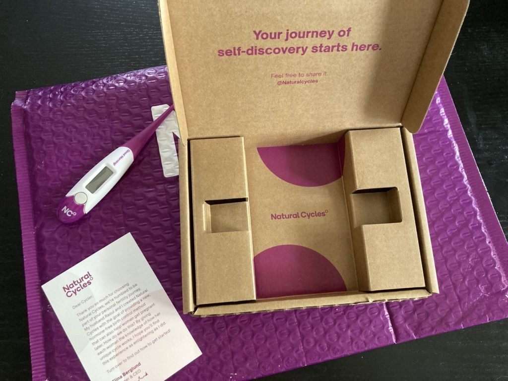
So, consider how you plan on getting your products to your customers in one piece. If you look at Natural Cycles, they keep their thermometer securely in place using a custom cardboard insert. Then, for additional protection, the cardboard box goes inside a bubble mailer.
Natural Cycles protective packaging
One thing I also want to point out with this unboxing experience is how they added design elements that only become visible as you continue to open the package. For example, when you open the box, you're greeted with an inspiring message on the inside flap. Then, as you remove the thermometer, you see another pop of color and their logo.
Again, it's simple but memorable. They give you all the things you need to get started and nothing more which keeps it from being overwhelming.
Natural Cycles Packaging Design Elements
Conclusion:
So there you have it - 3 simple tips for creating a memorable packaging design experience! If you want to learn more about packaging design, check out the other posts on my blog:
Or, if you're ready to get started but want a professional opinion on how to move forward you can book a consultation call with me! During our call, we can discuss strategy based on your specific business and look over any design mockups you've made yourself. You'll walk away with the strategy you need to implement a powerful packaging design experience!
Interested in Natural Cycles?
Again, I love Natural Cycles and believe in the brand's mission to empower every woman with the knowledge that she needs to take charge of her health using hormone-free, side-effect-free birth control! If this sounds like the solution you've been looking for, click the affiliate link below!
I am an affiliate with Natural Cycles, so by clicking the link, you'll receive 20% off!
