3 Tips from Curology's Skincare Packaging
One thing I love to do as a packaging designer is to take a good, close look at the products around me. Every time I order something new online, I pay attention to their customer experience, email sequences, and, of course, the unboxing experience when it arrives at my home. So this week, I'm sharing a deep dive into the skincare brand, Curology, and how they create a memorable, emotional, and shareable packaging design experience. I'll be covering 3 tips from Curology's skincare packaging to help you along your own packaging journey!

Packaging Tip #1: Use your key brand colors for a memorable first impression
I talked about this a lot in my last post, 3 Simple Packaging Design Tips for Beginners, where I took a look at the packaging design for Natural Cycles. But, clearly, it's worth saying again haha.
Using your key brand color (or colors) is a great way to build brand recognition online and with your customers. The goal here is to make a clear mental association between your brand and the colors that represent it. For example, if I said Target, you would think of the color red and if I said Walmart, you would think of the color blue.
You want your customer to see your brand colors and be able to instantly recall your brand name, or, if they're looking for your products, to be able to look for your brand colors to know that they found the right ones. Just think, if you're at Sephora for example (either online or in-stores) looking for a specific product, it's much easier to scan the many products for color rather than a tony logo. As consumers, we do this without even thinking about it.
So, stick to your key, signature brand color when it comes to your packaging design!
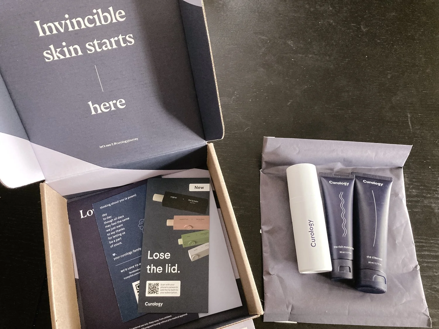
Packaging Tip #2: What you say matters
What you say on your packaging and how you say it is, again, part of that first impression. Think about first impressions in real life when you're talking to someone for the first time, face to face. Most of us pay more attention to our words and actions in these situations versus when we're hanging out with our best friends for the ten thousandth time.
So pay attention to what you say on your packaging. Think about your brand values, what sets your brand apart from your competitors, and the key feelings or takeaways you want all of your first-time customers to have. Then, consider your brand's personality. This will help you determine HOW to say what you want to communicate. Is your brand cheeky, playful, friendly, or elegant?
Let's take Curology's copywriting for example. Their brand is very friendly and geared towards the everyday, average young person.
Curology's copy: "Invincible skin starts here" and "Love your skin every day"
If Curology was a high-end, exclusive brand they might say this instead: "The most-wanted skincare at your fingertips" and "Elevate your ritual"
See what I mean? Now it's your turn. Write down your ideas and always remember to make sure it aligns with your brand's tone of voice, values, and personality (a.k.a. your brand strategy.)

Packaging Tip #3: Guide them along their journey
Using your brand colors and some thoughtful copywriting, chances are you've already made a memorable and emotional connection with your customer. This 3rd tip is the part that truly results in more customer love, loyalty, and sales.
You have your customer's attention, so you want to guide them on where to go next to continue their journey with your brand. Some examples of this would be to guide them to your social media community, website, blog, app, etc. The goal here is to get them to interact with your brand on another level so you can continue to foster a lasting relationship.
Consumers want to feel connected to brands that they prioritize their money with, they want to feel like they are a part of a community and have the opportunity to connect with like-minded consumers. So, consider which area you'd like your customers to go to most and make sure to have a clear call-to-action that tells them how to get there and why they should go.
Here are a few examples from Curology's packaging:
a QR code that directs you to see a new product they just launched
a QR code promoting the customer to leave a review
a hashtag on the inside box flap saying, "Let's see it #curologyjourney"
They give the customer multiple ways in which they can interact with their brand and the brand's community further by sharing their feedback, progress pictures, or seeing posts from other Curology customers.

Now it's time to start implementing these tips from Curology's packaging!
To recap, you want to use your brand's key colors to build a memorable packaging experience that fosters brand recognition. Then you want to curate thoughtful copywriting that communicates your brand's personality, values, and key differentiators. Lastly, you want to invite your customers to continue their journey with your brand by giving them a clear call-to-action for what to do next.