Packaging Design for Highlights Products

In this week's post, I'm sharing a behind-the-scenes journey of my partnership with Highlights for Children as their product team's Senior Packaging Design Consultant.
The Client: Highlights for Children educational kid's products
Highlights for Children is a company that has "helped create joyful childhoods across the globe over the last 75 years". Starting in 1946 as a magazine that inspired children to "become their best selves", Highlights has transcended its original medium. They've grown beyond magazines to the point that they now offer books, subscriptions, clothes, and activity kits!
That's where WildHive Studio comes in.
Back in October of 2021, the VP of Product at Highlights reached out to me looking for someone to help them create memorable, emotional, and shareable packaging designs for their new line of educational products. As a big fan of the Highlights brand and its values, I jumped at the opportunity to join their team as their Senior Packaging Design Consultant.
Why I loved designing packaging for an educational kids' brand.
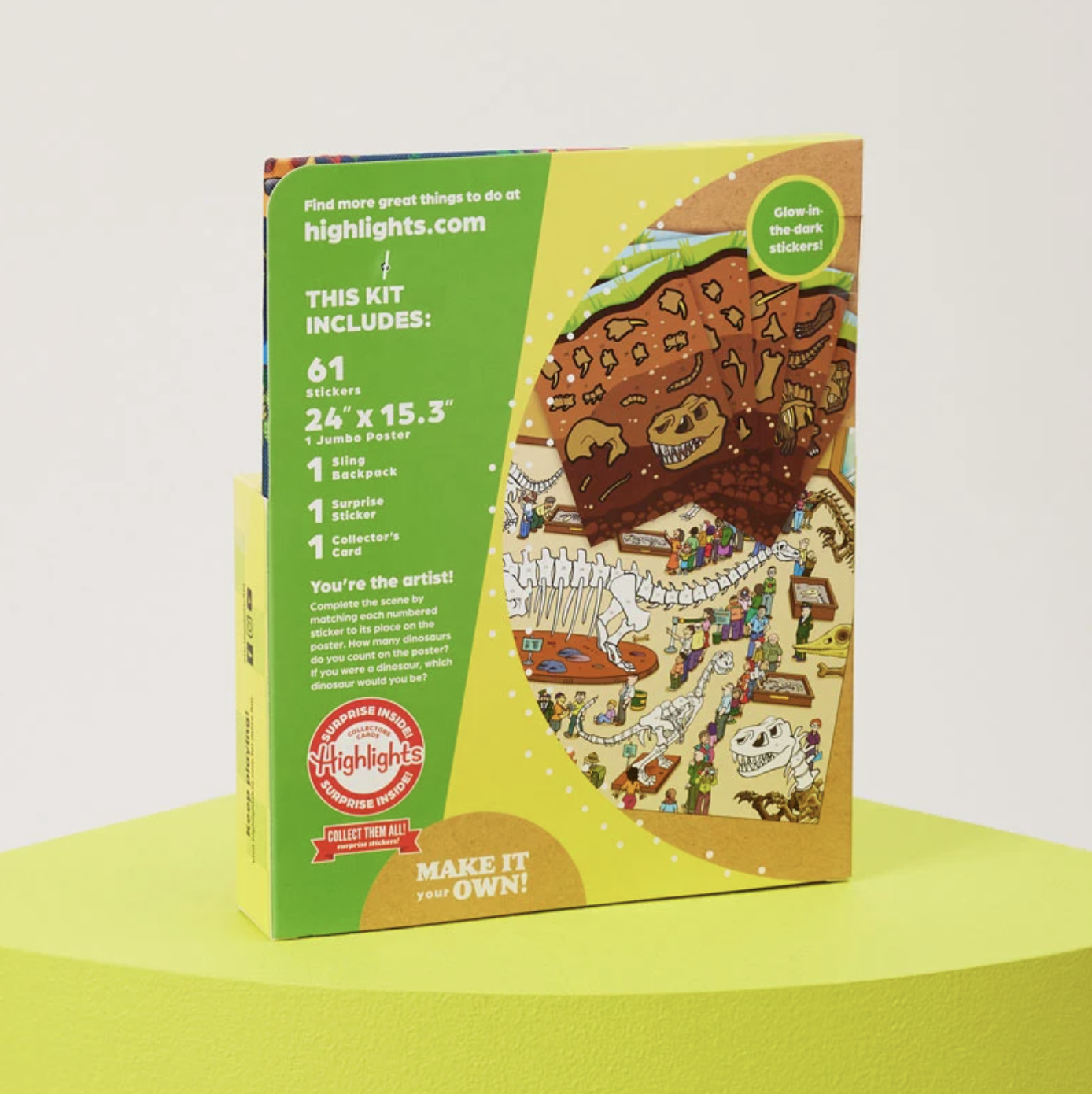
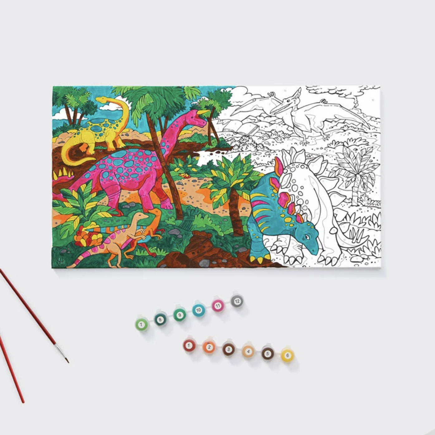
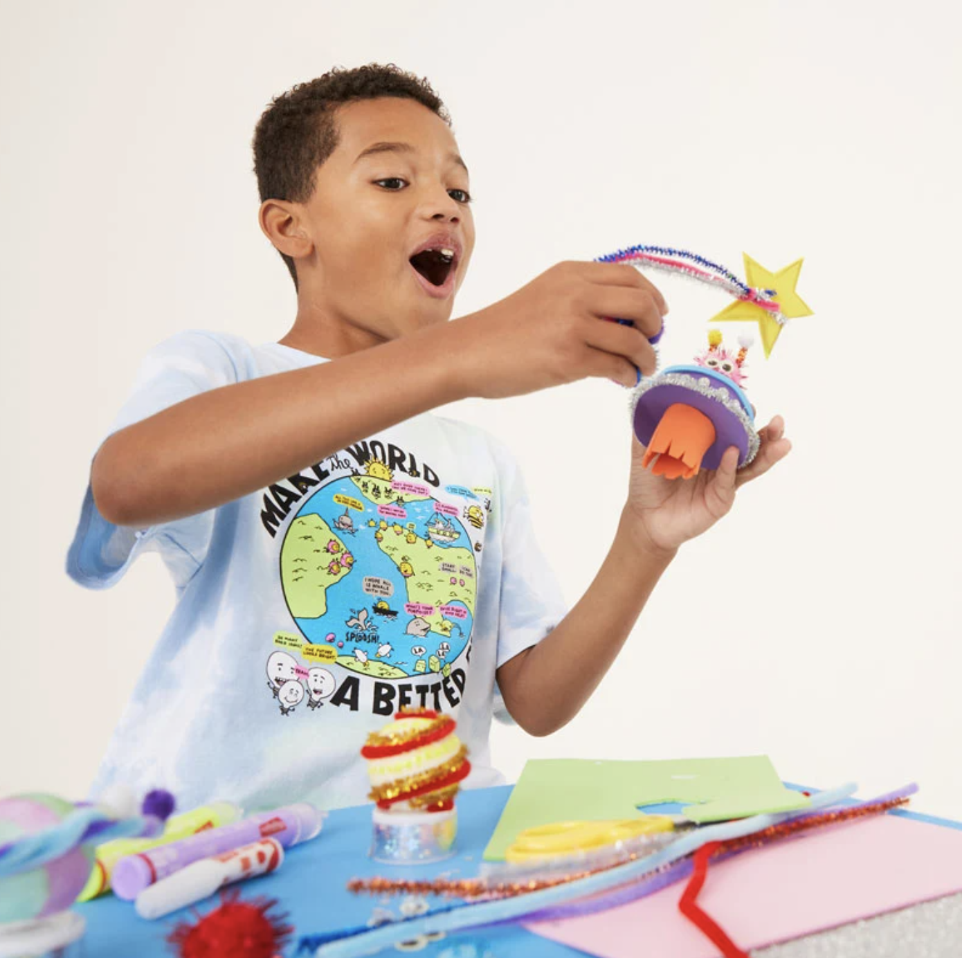
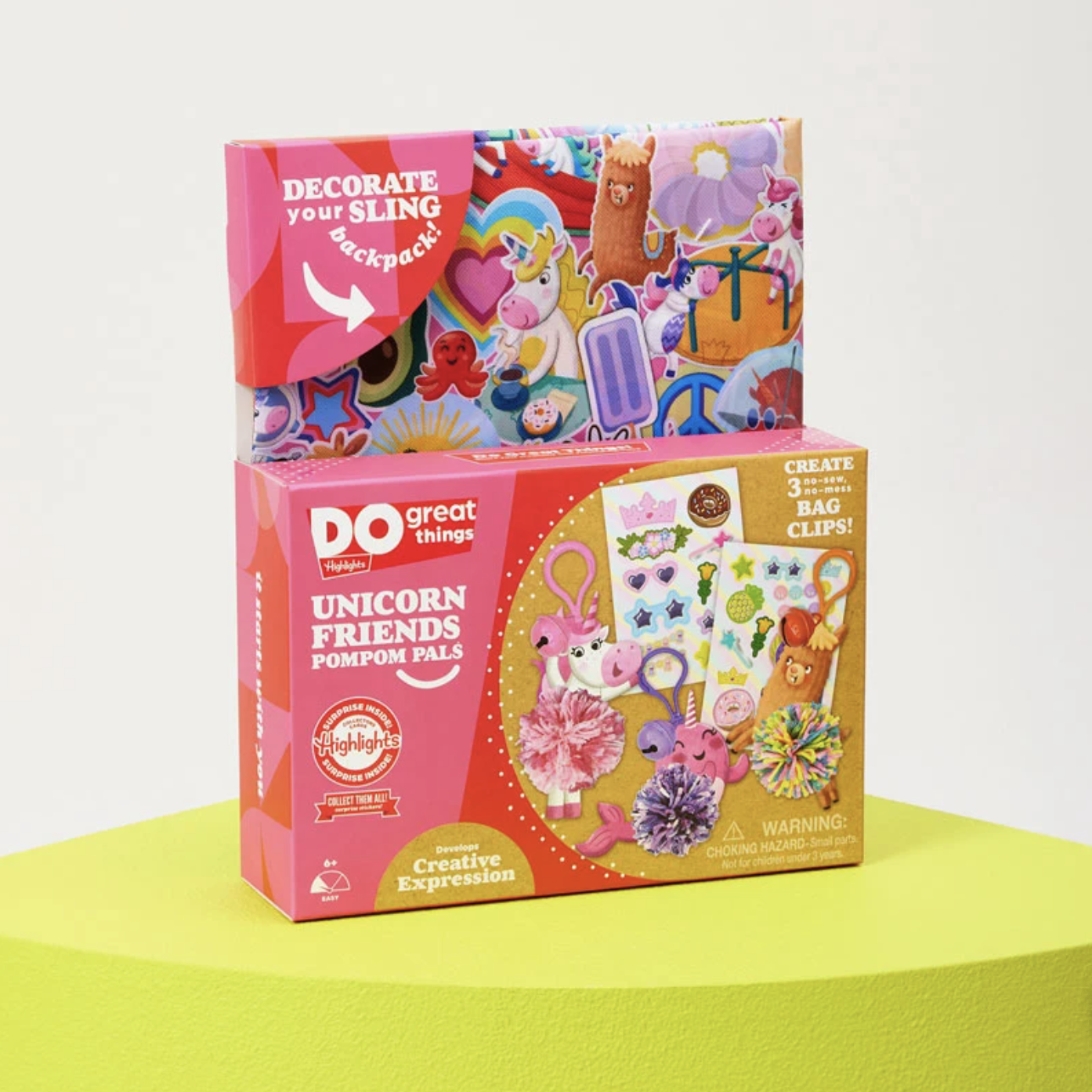
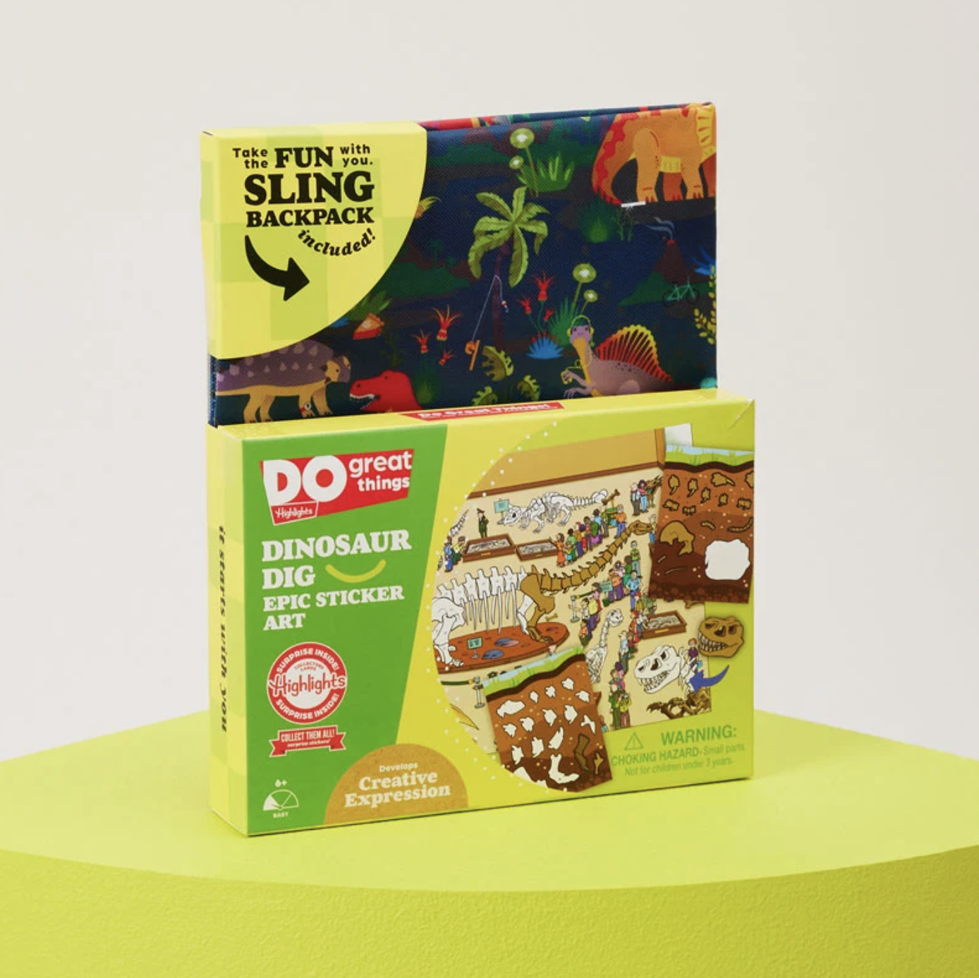
I remembered Highlights from my childhood (most notably their amazing Hidden Pictures Puzzles) and was excited by the opportunity to join forces with a company that promoted so much good. As the Senior Packaging Design Consultant for the Highlights product team, I got to see how much care and consideration goes into the ideation of each product to make sure it's bringing educational value to children's lives. In fact, I even learned a few fun facts myself as I designed activity kit contents such as the Dino Dig Sticker Art Kit.

The Challenge: Creating unique packaging designs that stand out in the kids' craft kit market
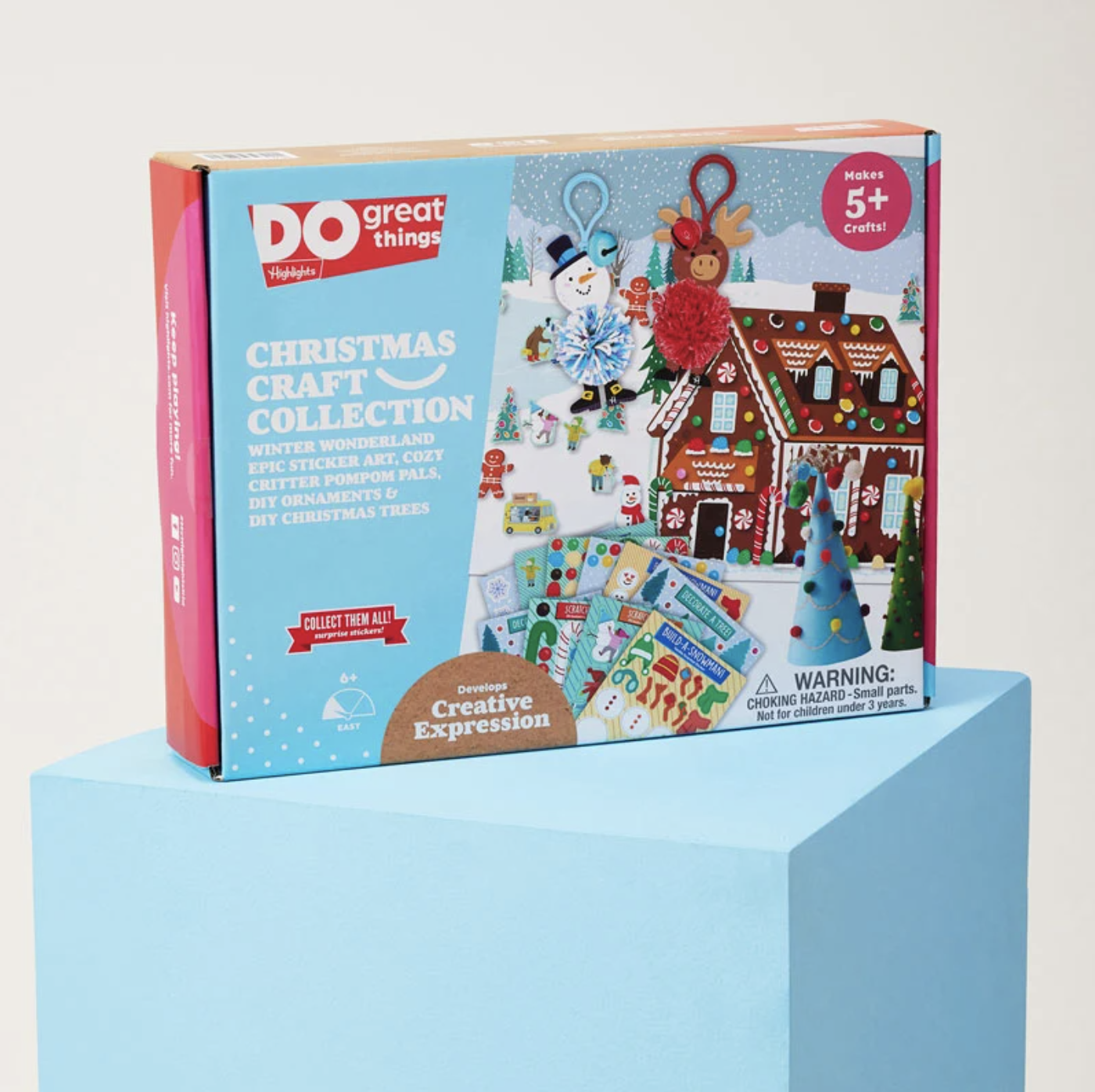
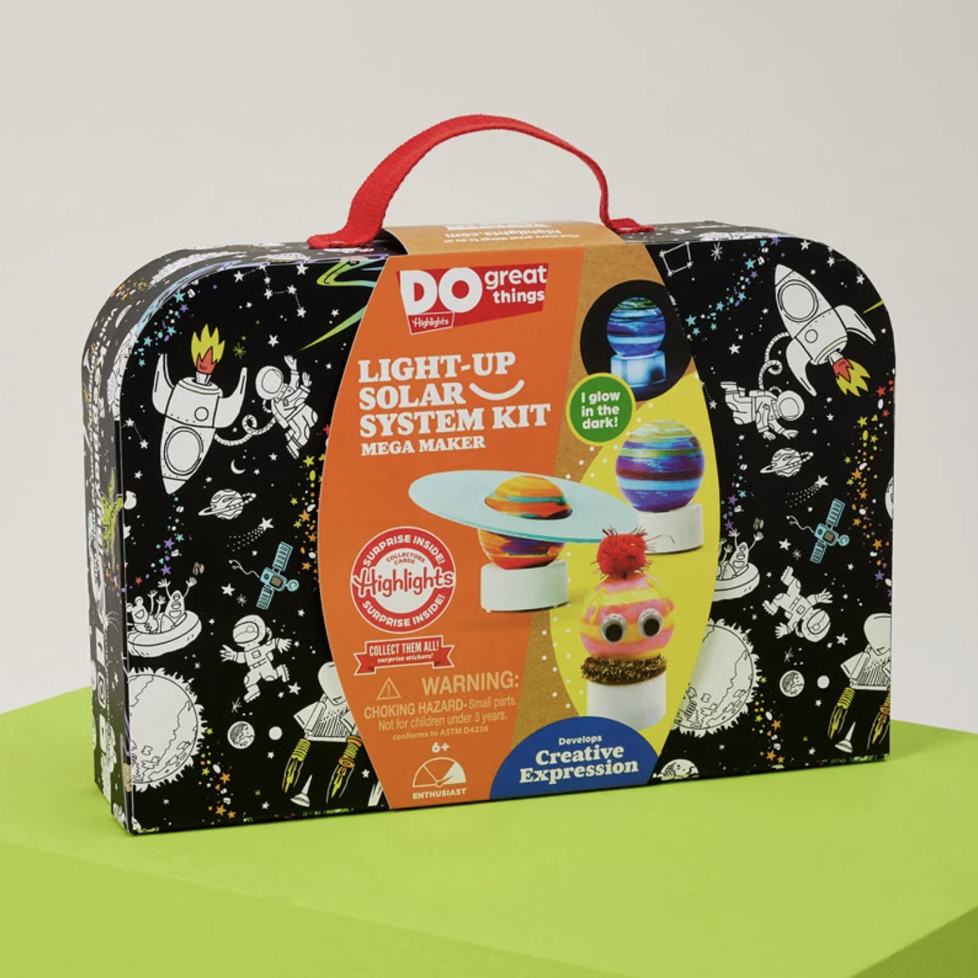
When I started with Highlights, one of my first tasks was to use the Highlights brand guidelines and translate it into packaging that could be spotted and recognized as Highlights amidst activity and craft kit competitors. When thinking about the goal of getting these products in stores such as Barnes & Nobles, Target, and JoAnns, I needed to make sure they stood out from the crowd.
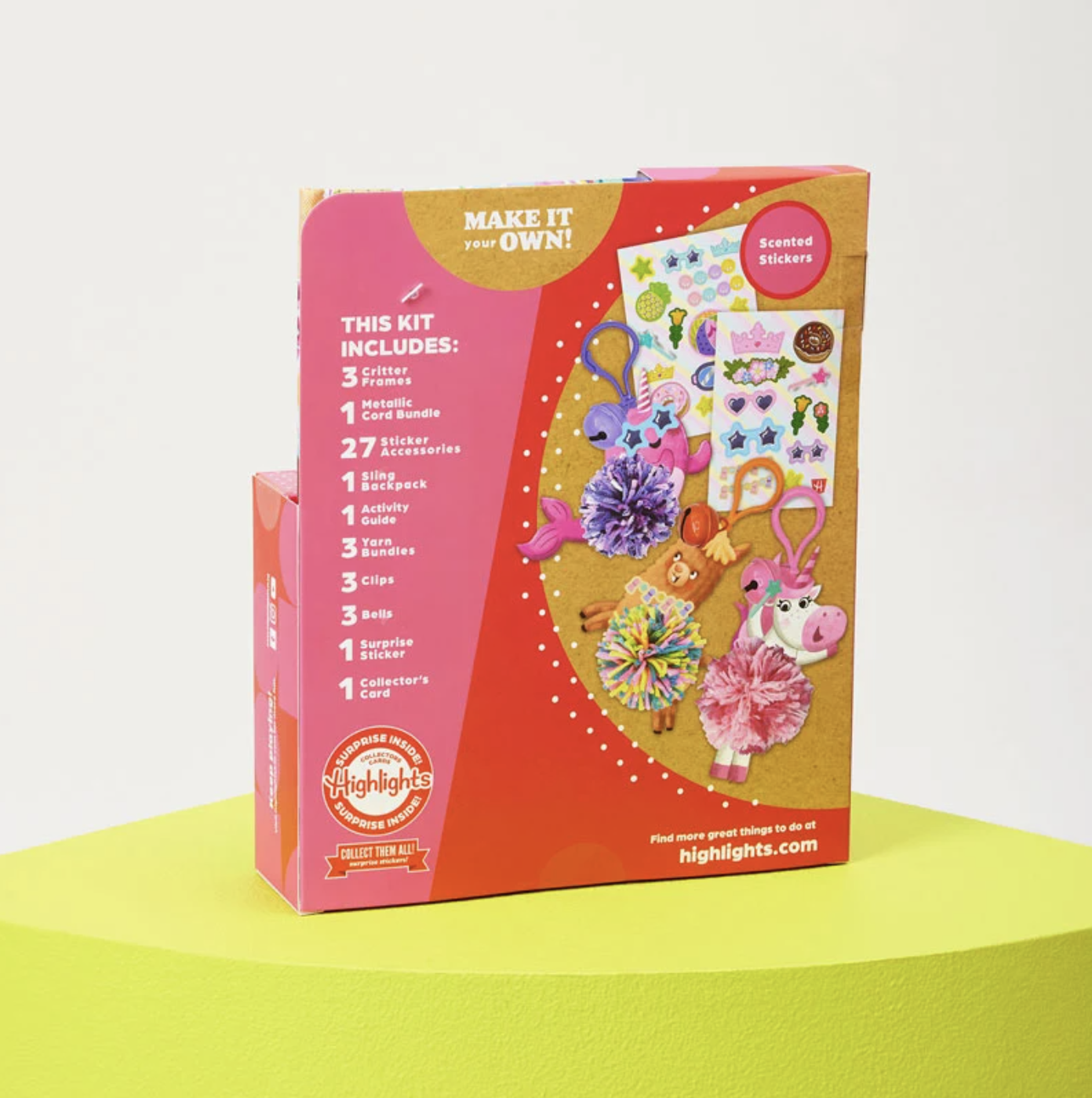
In addition to being memorable, the secondary goal was to ensure that the packaging design was versatile. It needed to work with a variety of box shapes and sizes and the product line grew.


The Design Solution: Colorful, informative, and shareable packaging design
Research:
With these goals in mind, I started with a lot of market research. I took a deep look at what products and designs were currently in the market and took note of what was working and what wasn't. With that information top of mind, I chose elements that worked with the Highlight's brand and incorporated my own ideas to keep their packaging looking fresh.
Concepting the Packaging Design:
Jumping into the design process, I took iconic shapes from the highlights brand as well as their bright, playful colors and created a variety of prints and box layouts. I wanted these shapes to be the hero and common thread between all the packaging designs.
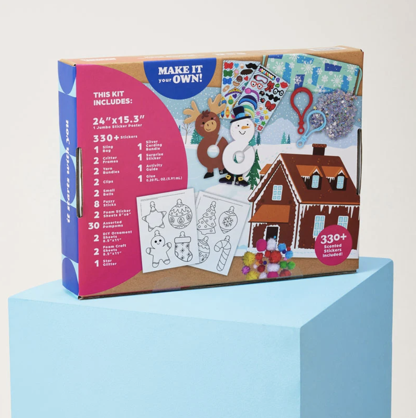
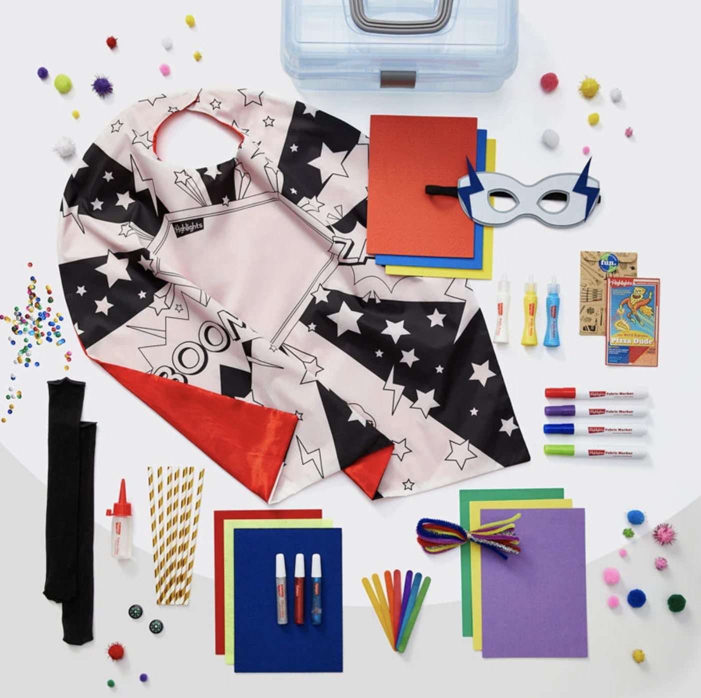
Another challenge with activity kits, in particular, was the contents. The packaging design needed to be versatile enough to pair well with a sticker by number one day and a light-up superhero supply kit the next. With each kit containing such different components, I created packaging guidelines that ebbed and flowed to allow for any number of product images to be shown on a variety of packaging shapes.
Then, I worked with the product team to determine what each box needed to say. We discussed what brand callouts needed to be the same on every box such as "Make it Your Own", and which would change from product to product such as the skill that each activity developed. Once we knew what each pack needed to communicate to the customers, I was able to incorporate the text into the designs in ways that clearly communicated each kit's unique value and informed the customer on how to further interact with the brand.
If you're familiar with my blog, you know that I'm all about making packaging that's memorable, emotional, and shareable. I can confidently say that the Highlights team and I accomplished just that.


"Working with Whitney has been amazing, she delivers exceptionally creative high-quality work with incredible speed – she is an asset to our team, and she is a pleasure to work with!
- Jennifer Faux, VP of Lifestyles Product Development & Design at Highlights for Children
What's next in terms of Highlights packaging design?
I can't reveal too much just yet, but Highlights and I have been working hard this year to bring children more fun, educational kits, back-to-school accessories, and much more!